class: title-slide, nobar  ## NRI 7350 # Plots and Loading Data .footnote[Artwork by [@allison_horst](https://github.com/allisonhorst/stats-illustrations)] --- # Check-in - Everyone getting emails? (e.g., email about these slides?) - Everyone have access to these slides? https://steffilazerte.ca/NRI_7350/slides.html --- class: split-60 # Data for Assignments 2, 3 and 4 > Assignment 2 (first R assignment!) comes next week ### You'll need a data set with - One *continuous* dependent variable (response) - One *categorical* independent variable with **at least three categories** (explanatory) - Two *continuous* independent variables (explanatory) ![:spacer 15px]() .columnl[ > Example: > > - response = `frequency` > - categorical explanatory = `site` > - continuous explanatory = `noise` and `mass` ] .columnr[ .medium[ <table class="table" style="margin-left: auto; margin-right: auto;"> <thead> <tr> <th style="text-align:right;"> frequency </th> <th style="text-align:left;"> site </th> <th style="text-align:right;"> noise </th> <th style="text-align:right;"> mass </th> </tr> </thead> <tbody> <tr> <td style="text-align:right;"> 3500 </td> <td style="text-align:left;"> rural </td> <td style="text-align:right;"> 45 </td> <td style="text-align:right;"> 11.0 </td> </tr> <tr> <td style="text-align:right;"> 3600 </td> <td style="text-align:left;"> city </td> <td style="text-align:right;"> 65 </td> <td style="text-align:right;"> 10.0 </td> </tr> <tr> <td style="text-align:right;"> 3555 </td> <td style="text-align:left;"> town </td> <td style="text-align:right;"> 55 </td> <td style="text-align:right;"> 10.5 </td> </tr> <tr> <td style="text-align:right;"> 3650 </td> <td style="text-align:left;"> rural </td> <td style="text-align:right;"> 47 </td> <td style="text-align:right;"> 9.5 </td> </tr> <tr> <td style="text-align:right;"> 3300 </td> <td style="text-align:left;"> town </td> <td style="text-align:right;"> 52 </td> <td style="text-align:right;"> 10.0 </td> </tr> </tbody> </table> ]] --- # Data for Assignments 2, 3 and 4 ### Don't have enough variables? You can... - Create a categorical variable from continuous - `noise` in dB = `quiet`, `regular`, `noisy` - `mass` in grams = `small`, `medium`, `large` - `concentration` in g/mL = `low`, `medium`, `high` - `amount` = `none`, `some`, `lots` - Create a dummy continuous variable - `x` = random numbers between 1 and 250 ### Don't have any data? - Ask your supervisor for something related to your project - Ask your fellow students - Email Nicky and I together with a brief description of your project and its design and we'll figure something out --- class: section # Getting started (again) Open RStudio Open your NRI project Open a **new** script for today: File > New File > R Script <br> Make sure to load `tidyverse` at the top: `library(tidyverse)` --- class: section # Creating Figures --- class: nobar # `ggplot2`  .footnote[Artwork by [@allison_horst](https://github.com/allisonhorst/stats-illustrations)] --- # Our data set: Palmer Penguins! 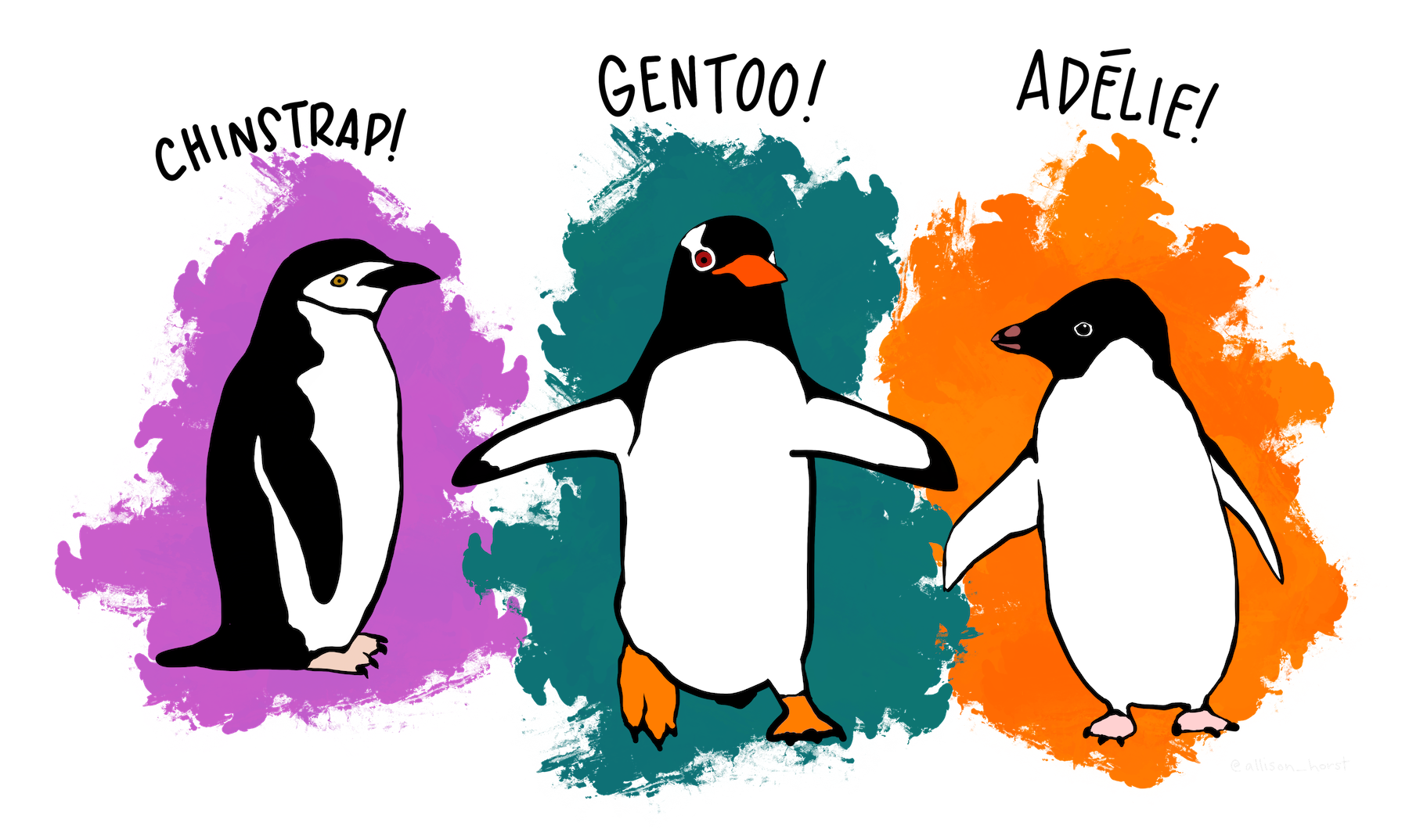 .footnote[Artwork by [@allison_horst](https://github.com/allisonhorst/stats-illustrations)]  --- # Our data set: Palmer Penguins! .small[ ```r library(palmerpenguins) penguins ``` ``` ## # A tibble: 344 × 8 ## species island bill_length_mm bill_depth_mm flipper_length_mm body_mass_g sex year ## <fct> <fct> <dbl> <dbl> <int> <int> <fct> <int> ## 1 Adelie Torgersen 39.1 18.7 181 3750 male 2007 ## 2 Adelie Torgersen 39.5 17.4 186 3800 female 2007 ## 3 Adelie Torgersen 40.3 18 195 3250 female 2007 ## 4 Adelie Torgersen NA NA NA NA <NA> 2007 ## 5 Adelie Torgersen 36.7 19.3 193 3450 female 2007 ## 6 Adelie Torgersen 39.3 20.6 190 3650 male 2007 ## 7 Adelie Torgersen 38.9 17.8 181 3625 female 2007 ## 8 Adelie Torgersen 39.2 19.6 195 4675 male 2007 ## 9 Adelie Torgersen 34.1 18.1 193 3475 <NA> 2007 ## 10 Adelie Torgersen 42 20.2 190 4250 <NA> 2007 ## # … with 334 more rows ``` ]  .footnote[Artwork by [@allison_horst](https://github.com/allisonhorst/stats-illustrations)]  -- > Your turn! Run this code and look at the output in the console --- # A basic plot <code class ='r hljs remark-code'>library(palmerpenguins)<br>library(tidyverse)<br><br>ggplot(data = penguins, aes(x = body_mass_g, y = bill_length_mm)) +<br> geom_point()</code> <img src="2 Loading Data and Creating Figures - answers_files/figure-html/basic_plot-flaired-1.png" width="70%" style="display: block; margin: auto;" /> --- # Break it down <code class ='r hljs remark-code'><span style="background-color:#ffff7f">library(palmerpenguins)</span><br>library(tidyverse)<br><br>ggplot(data = penguins, aes(x = body_mass_g, y = bill_length_mm)) +<br> geom_point()</code> ![:spacer 10px]() ### `library(palmerpenguins)` - Load the `palmerguins` package so we have access to `penguins` data --- # Break it down <code class ='r hljs remark-code'>library(palmerpenguins)<br><span style="background-color:#ffff7f">library(tidyverse)</span><br><br>ggplot(data = penguins, aes(x = body_mass_g, y = bill_length_mm)) +<br> geom_point()</code> ![:spacer 10px]() ### `library(tidyverse)` - Load the `tidyverse` package (which loads the `ggplot2` package) --- # Break it down <code class ='r hljs remark-code'>library(palmerpenguins)<br>library(tidyverse)<br><br><span style="background-color:#ffff7f">ggplot(data = penguins, aes(x = body_mass_g, y = bill_length_mm)) +</span><br> geom_point()</code> ![:spacer 10px]() ### `ggplot()` - Set the attributes of your plot - **`data`** = Dataset - **`aes`** = Aesthetics (how the data are used) - Think of this as your plot defaults --- # Break it down <code class ='r hljs remark-code'>library(palmerpenguins)<br>library(tidyverse)<br><br>ggplot(data = penguins, aes(x = body_mass_g, y = bill_length_mm)) +<br><span style="background-color:#ffff7f"> geom_point()</span></code> ![:spacer 10px]() ### `geom_point()` - Choose a `geom` function to display the data - Always *added* to a `ggplot()` call with **+** > ggplots are essentially layered objects, starting with a call to `ggplot()` --- class: split-50 # Plots are layered .columnl[ .small[ ```r ggplot(data = penguins, aes(x = sex, y = body_mass_g)) ``` <img src="2 Loading Data and Creating Figures - answers_files/figure-html/unnamed-chunk-8-1.png" width="90%" style="display: block; margin: auto;" /> ]] .columnr[ .small[ ```r ggplot(data = penguins, aes(x = sex, y = body_mass_g)) + * geom_boxplot() ``` <img src="2 Loading Data and Creating Figures - answers_files/figure-html/unnamed-chunk-9-1.png" width="90%" style="display: block; margin: auto;" /> ]] --- class: split-50 # Plots are layered .columnl[ .small[ ```r ggplot(data = penguins, aes(x = sex, y = body_mass_g)) ``` <img src="2 Loading Data and Creating Figures - answers_files/figure-html/unnamed-chunk-10-1.png" width="90%" style="display: block; margin: auto;" /> ]] .columnr[ .small[ ```r ggplot(data = penguins, aes(x = sex, y = body_mass_g)) + * geom_point() ``` <img src="2 Loading Data and Creating Figures - answers_files/figure-html/unnamed-chunk-11-1.png" width="90%" style="display: block; margin: auto;" /> ]] --- class:split-50 # Plots are layered .columnl[ .small[ ```r ggplot(data = penguins, aes(x = sex, y = body_mass_g)) ``` <img src="2 Loading Data and Creating Figures - answers_files/figure-html/unnamed-chunk-12-1.png" width="90%" style="display: block; margin: auto;" /> ]] .columnr[ .small[ ```r ggplot(data = penguins, aes(x = sex, y = body_mass_g)) + * geom_violin() ``` <img src="2 Loading Data and Creating Figures - answers_files/figure-html/unnamed-chunk-13-1.png" width="90%" style="display: block; margin: auto;" /> ]] --- class: split-50 # Plots are layered .columnl[ ### You can add multiple layers .small[ ```r ggplot(data = penguins, aes(x = sex, y = body_mass_g)) + geom_boxplot() ``` <img src="2 Loading Data and Creating Figures - answers_files/figure-html/unnamed-chunk-14-1.png" width="90%" style="display: block; margin: auto;" /> ]] --- class: split-50 # Plots are layered .columnl[ ### You can add multiple layers .small[ ```r ggplot(data = penguins, aes(x = sex, y = body_mass_g)) + geom_boxplot() + * geom_point(size = 2, colour = "red") ``` <img src="2 Loading Data and Creating Figures - answers_files/figure-html/unnamed-chunk-15-1.png" width="90%" style="display: block; margin: auto;" /> ]] -- .columnr[ ### Order matters .small[ ```r ggplot(data = penguins, aes(x = sex, y = body_mass_g)) + * geom_point(size = 2, colour = "red") + geom_boxplot() ``` <img src="2 Loading Data and Creating Figures - answers_files/figure-html/unnamed-chunk-16-1.png" width="90%" style="display: block; margin: auto;" /> ]] --- class: split-50 # Plots are objects #### Any ggplot can be saved as an object ```r g <- ggplot(data = penguins, aes(x = sex, y = body_mass_g)) ``` -- .columnl[ ```r g ``` <img src="2 Loading Data and Creating Figures - answers_files/figure-html/unnamed-chunk-18-1.png" width="90%" style="display: block; margin: auto;" /> ] -- .columnr[ ```r g + geom_boxplot() ``` <img src="2 Loading Data and Creating Figures - answers_files/figure-html/unnamed-chunk-19-1.png" width="90%" style="display: block; margin: auto;" /> ] --- class: section # More Geoms ### (Plot types) --- # Geoms: Lines ```r ggplot(data = penguins, aes(x = body_mass_g, y = bill_length_mm)) + * geom_line() ``` <img src="2 Loading Data and Creating Figures - answers_files/figure-html/unnamed-chunk-20-1.png" width="90%" style="display: block; margin: auto;" /> --- # Geoms: Histogram ```r ggplot(data = penguins, aes(x = body_mass_g)) + * geom_histogram(binwidth = 100) ``` <img src="2 Loading Data and Creating Figures - answers_files/figure-html/unnamed-chunk-21-1.png" width="90%" style="display: block; margin: auto;" /> -- ) --- # Geoms: Barplots ### Let `ggplot` count your data ```r ggplot(data = penguins, aes(x = species)) + * geom_bar() ``` <img src="2 Loading Data and Creating Figures - answers_files/figure-html/unnamed-chunk-22-1.png" width="90%" style="display: block; margin: auto;" /> --- # Geoms: Barplots ### **Or**, you can provide the counts .small[(makes more sense when you already/only have counts)] ```r species_counts <- count(penguins, species) ggplot(data = species_counts, aes(x = species, y = n)) + * geom_bar(stat = "identity") ``` <img src="2 Loading Data and Creating Figures - answers_files/figure-html/count-1.png" width="90%" style="display: block; margin: auto;" /> --- # Side Note: `tidyverse` functions ### **Or**, you can provide the counts .small[(makes more sense when you already/only have counts)] <code class ='r hljs remark-code'>species_counts <- count(<strong><span style="color:#440154">penguins</span></strong>, <span style="color:deeppink">species)</span></code> ### `count()` - `tidyverse` functions always start with the **<span style="color:#440154">data</span>**, followed by other arguments - you can reference any **<span style="color:deeppink">column</span>** from '**<span style="color:#440154">data</span>**' - `count()` the number of observations per unique `column` category ```r species_counts ``` ``` ## # A tibble: 3 × 2 ## species n ## <fct> <int> ## 1 Adelie 152 ## 2 Chinstrap 68 ## 3 Gentoo 124 ``` --- # Your Turn: Create this plot <code class ='r hljs remark-code'>library(ggplot2)<br><br>ggplot(data = <span style="background-color:#ffff7f"> </span>, aes(x = <span style="background-color:#ffff7f"> </span>, y = <span style="background-color:#ffff7f"> </span>)) +<br> geom_<span style="background-color:#ffff7f"> </span>(<span style="background-color:#ffff7f"> </span>)</code> <img src="2 Loading Data and Creating Figures - answers_files/figure-html/yt_boxplot-flaired-1.png" width="90%" style="display: block; margin: auto;" /> --- exclude: FALSE # Your Turn: Create this plot <code class ='r hljs remark-code'>library(ggplot2)<br><br>ggplot(data = penguins, aes(x = island, y = bill_depth_mm)) +<br> geom_boxplot(colour = "blue")</code> <img src="2 Loading Data and Creating Figures - answers_files/figure-html/yt_boxplot-flaired-r78ih2v-1.png" width="90%" style="display: block; margin: auto;" /> --- class: section # Showing data by group --- # Mapping aesthetics ```r ggplot(data = penguins, aes(x = body_mass_g, y = bill_length_mm)) + geom_point() ``` <img src="2 Loading Data and Creating Figures - answers_files/figure-html/unnamed-chunk-28-1.png" width="80%" style="display: block; margin: auto;" /> --- # Mapping aesthetics <code class ='r hljs remark-code'>ggplot(data = penguins, aes(x = body_mass_g, y = bill_length_mm, <span style="background-color:#ffff7f">colour = sex</span>)) +<br> geom_point()</code> <img src="2 Loading Data and Creating Figures - answers_files/figure-html/aes-flaired-1.png" width="90%" style="display: block; margin: auto;" /> --- # Mapping aesthetics <img src="2 Loading Data and Creating Figures - answers_files/figure-html/unnamed-chunk-30-1.png" width="100%" style="display: block; margin: auto;" /> --- # Mapping aesthetics ### `ggplot` automatically populates the legends (combining where it can) ```r ggplot(data = penguins, aes(x = body_mass_g, y = bill_length_mm, colour = sex, shape = sex)) + geom_point() ``` <img src="2 Loading Data and Creating Figures - answers_files/figure-html/unnamed-chunk-31-1.png" width="90%" style="display: block; margin: auto;" /> --- # Faceting: `facet_wrap()` ```r ggplot(data = penguins, aes(x = body_mass_g, y = bill_length_mm, colour = sex)) + geom_point() + * facet_wrap(~ species) ``` <img src="2 Loading Data and Creating Figures - answers_files/figure-html/unnamed-chunk-32-1.png" width="90%" style="display: block; margin: auto;" />  --- # Faceting: `facet_grid()` ```r ggplot(data = penguins, aes(x = body_mass_g, y = bill_length_mm, colour = sex)) + geom_point() + * facet_grid(sex ~ species) ``` <img src="2 Loading Data and Creating Figures - answers_files/figure-html/unnamed-chunk-33-1.png" width="90%" style="display: block; margin: auto;" />  --- # Your Turn: Create this plot <code class ='r hljs remark-code'>ggplot(data = <span style="background-color:#ffff7f"> </span>, aes(<span style="background-color:#ffff7f"> </span>)) + <br> <span style="background-color:#ffff7f"> </span> + <br> <span style="background-color:#ffff7f"> </span></code> <img src="2 Loading Data and Creating Figures - answers_files/figure-html/yt_facet-flaired-1.png" width="90%" style="display: block; margin: auto;" /> ![:spacer 15px]() > **Hint:** `colour` is for outlining with a colour, `fill` is for 'filling' with a colour --- exclude: FALSE # Your Turn: Create this plot <code class ='r hljs remark-code'>ggplot(data = penguins, aes(x = sex, y = flipper_length_mm, fill = sex)) + <br> geom_boxplot() + <br> facet_wrap(~ species)</code> <img src="2 Loading Data and Creating Figures - answers_files/figure-html/yt_facet-flaired-hz3d56l-1.png" width="90%" style="display: block; margin: auto;" /> ![:spacer 15px]() > **Hint:** `colour` is for outlining with a colour, `fill` is for 'filling' with a colour --- exclude: true class: section # Adding Statistics to Plots --- exclude: true # Using stats: Summarizing data ### Add data means as points ```r ggplot(data = penguins, aes(x = sex, y = body_mass_g)) + * stat_summary(geom = "point", fun.y = mean) ``` <img src="2 Loading Data and Creating Figures - answers_files/figure-html/unnamed-chunk-36-1.png" width="90%" style="display: block; margin: auto;" /> --- exclude: true # Using stats: Summarizing data ### Add error bars, calculated from the data ```r ggplot(data = penguins, aes(x = sex, y = body_mass_g)) + stat_summary(geom = "point", fun.y = mean) + * stat_summary(geom = "errorbar", width = 0.05, fun.data = mean_se) ``` <img src="2 Loading Data and Creating Figures - answers_files/figure-html/unnamed-chunk-37-1.png" width="90%" style="display: block; margin: auto;" /> --- class: section # Trendlines / Regression Lines --- # Trendlines / Regression lines ### `geom_line()` is connect-the-dots, not a trend or linear model ```r ggplot(data = penguins, aes(x = body_mass_g, y = bill_length_mm)) + geom_point() + geom_line() ``` <img src="2 Loading Data and Creating Figures - answers_files/figure-html/unnamed-chunk-38-1.png" width="90%" style="display: block; margin: auto;" /> --  --- # Trendlines / Regression lines ### Let's add a trend line properly Start with basic plot: ```r g <- ggplot(data = penguins, aes(x = body_mass_g, y = bill_length_mm)) + geom_point() g ``` <img src="2 Loading Data and Creating Figures - answers_files/figure-html/unnamed-chunk-39-1.png" width="90%" style="display: block; margin: auto;" /> --- class: split-45 # Trendlines / Regression lines .columnl[ ### Add the `stat_smooth()` - `lm` is for "linear model" (i.e. trendline) - grey ribbon = standard error ] .columnr[ <code class ='r hljs remark-code'>g + <span style="background-color:#ffff7f">stat_smooth(method = "lm")</span></code> ] ![:spacer 55px]() <img src="2 Loading Data and Creating Figures - answers_files/figure-html/unnamed-chunk-41-1.png" width="90%" style="display: block; margin: auto;" /> --- class: split-45 # Trendlines / Regression lines .columnl[ ### Add the `stat_smooth()` - remove the grey ribbon `se = FALSE` ] .columnr[ <code class ='r hljs remark-code'>g + stat_smooth(method = "lm", <span style="background-color:#ffff7f">se = FALSE</span>)</code> ] ![:spacer 55px]() <img src="2 Loading Data and Creating Figures - answers_files/figure-html/unnamed-chunk-43-1.png" width="90%" style="display: block; margin: auto;" /> --- # Trendlines / Regression lines ### A line for each group - Specify group (here we use `colour` to specify `sex`) ```r g <- ggplot(data = penguins, aes(x = body_mass_g, y = bill_length_mm, colour = species)) + geom_point() g ``` <img src="2 Loading Data and Creating Figures - answers_files/figure-html/unnamed-chunk-44-1.png" width="90%" style="display: block; margin: auto;" /> --- # Using stats: Trendlines / Regression lines ### A line for each group - `stat_smooth()` automatically uses the same grouping ```r g + stat_smooth(method = "lm", se = FALSE) ``` <img src="2 Loading Data and Creating Figures - answers_files/figure-html/unnamed-chunk-45-1.png" width="90%" style="display: block; margin: auto;" /> --- # Trendlines / Regression lines ### A line for each group AND overall ```r g + stat_smooth(method = "lm", se = FALSE) + stat_smooth(method = "lm", se = FALSE, colour = "black") ``` <img src="2 Loading Data and Creating Figures - answers_files/figure-html/unnamed-chunk-46-1.png" width="90%" style="display: block; margin: auto;" /> --- # Your Turn: Create this plot - A scatter plot - Comparing Flipper Length by Body Mass grouped by Species - With *a single regression line for the overall trend* --- exclude: FALSE # Your Turn: Create this plot - A scatter plot - Comparing Flipper Length by Body Mass grouped by Species - With *a single regression line for the overall trend* ```r ggplot(data = penguins, aes(x = body_mass_g, y = flipper_length_mm, colour = species)) + geom_point() + stat_smooth(se = FALSE, colour = "black", method = "lm") ``` <img src="2 Loading Data and Creating Figures - answers_files/figure-html/unnamed-chunk-47-1.png" width="90%" style="display: block; margin: auto;" /> --- class: section # Customizing plots --- # Customizing: Starting plot ### Let's work with this plot ```r g <- ggplot(data = penguins, aes(x = body_mass_g, y = bill_length_mm, colour = species)) + geom_point() ``` <img src="2 Loading Data and Creating Figures - answers_files/figure-html/unnamed-chunk-49-1.png" width="90%" style="display: block; margin: auto;" /> --- # Customizing: Labels ```r g + labs(title = "Bill Length vs. Body Mass", x = "Body Mass (g)", y = "Bill Length (mm)", colour = "Species", tag = "A") ``` <img src="2 Loading Data and Creating Figures - answers_files/figure-html/unnamed-chunk-50-1.png" width="90%" style="display: block; margin: auto;" /> --  --- class: split-50 # Customizing: Built-in themes .columnl[ <img src="2 Loading Data and Creating Figures - answers_files/figure-html/unnamed-chunk-51-1.png" width="95%" style="display: block; margin: auto;" /><img src="2 Loading Data and Creating Figures - answers_files/figure-html/unnamed-chunk-51-2.png" width="95%" style="display: block; margin: auto;" /> ] .columnr[ <img src="2 Loading Data and Creating Figures - answers_files/figure-html/unnamed-chunk-52-1.png" width="95%" style="display: block; margin: auto;" /><img src="2 Loading Data and Creating Figures - answers_files/figure-html/unnamed-chunk-52-2.png" width="95%" style="display: block; margin: auto;" /> ] --- # Customizing: Data range ### Limit the data (exclude data) ```r g + xlim(c(4000, 5000)) ``` <img src="2 Loading Data and Creating Figures - answers_files/figure-html/lim_warn-1.png" width="90%" style="display: block; margin: auto;" /> ``` ## Warning: Removed 228 rows containing missing values (geom_point). ``` --- # Customizing: Axes `scale_` + (`x` or `y`) + type (`contiuous`, `discrete`, `date`, `datetime`) - `scale_x_continuous()` - `scale_y_discrete()` - etc. ### Common arguments ```r g + scale_x_continuous(breaks = seq(0, 20, 10)) # Tick breaks g + scale_x_continuous(limits = c(0, 15)) # xlim() is a shortcut for this g + scale_x_continuous(expand = c(0, 0)) # Space between axis and data ``` --- # Customizing: Axes <img src="2 Loading Data and Creating Figures - answers_files/figure-html/unnamed-chunk-55-1.png" width="80%" style="display: block; margin: auto;" /> --- # Customizing: Aesthetics ### Using scales `scale_` + aesthetic (`colour`, `fill`, `size`, etc.) + type (`manual`, `continuous`, `datetime`, etc.) ```r g + scale_colour_manual(name = "Type", values = c("green", "purple", "yellow")) ``` <img src="2 Loading Data and Creating Figures - answers_files/figure-html/unnamed-chunk-56-1.png" width="90%" style="display: block; margin: auto;" /> --- # Customizing: Aesthetics ### Using scales Or be very explicit: ```r g + scale_colour_manual(name = "Type", values = c("Adelie" = "green", "Gentoo" = "purple", "Chinstrap" = "yellow"), na.value = "black") ``` <img src="2 Loading Data and Creating Figures - answers_files/figure-html/unnamed-chunk-57-1.png" width="90%" style="display: block; margin: auto;" /> --- # Customizing: Aesthetics ### For colours, consider colour-blind-friendly scales ```r library(ggthemes) g + scale_colour_colorblind(name = "Type") g + scale_colour_viridis_d(name = "Type") ``` <img src="2 Loading Data and Creating Figures - answers_files/figure-html/unnamed-chunk-59-1.png" width="100%" style="display: block; margin: auto;" /> --- # Customizing: Aesthetics ### Forcing Remove the association between a variable and an aesthetic <code class ='r hljs remark-code'>ggplot(data = penguins, aes(x = body_mass_g, y = bill_length_mm, colour = sex)) +<br> geom_point(<span style="background-color:#ffff7f">colour = "green", size = 5</span>) +<br> stat_smooth(method = "lm", se = FALSE, <span style="background-color:#ffff7f">colour = "red"</span>)</code> <img src="2 Loading Data and Creating Figures - answers_files/figure-html/forcing-flaired-1.png" width="90%" style="display: block; margin: auto;" /> <code>) --- class: split-50 # Customizing: Legends placement .columnl[ ### At the: top, bottom, left, right ```r g + theme(legend.position = "top") ``` <img src="2 Loading Data and Creating Figures - answers_files/figure-html/unnamed-chunk-61-1.png" width="100%" style="display: block; margin: auto;" /> ] .columnr[ ### Exactly here ```r g + theme(legend.position = c(0.15, 0.7)) ``` <img src="2 Loading Data and Creating Figures - answers_files/figure-html/unnamed-chunk-62-1.png" width="100%" style="display: block; margin: auto;" /> ] --- class: section # Combining plots with `patchwork` ## Further Reading: <https://patchwork.data-imaginist.com/> --- # Combining plots with `patchwork` ### Setup - Load `patchwork` - Create a couple of different plots ```r library(patchwork) g1 <- ggplot(data = penguins, aes(x = bill_length_mm, y = bill_depth_mm, colour = species)) + geom_point() g2 <- ggplot(data = penguins, aes(x = species, y = flipper_length_mm)) + geom_boxplot() g3 <- ggplot(data = penguins, aes(x = flipper_length_mm, y = body_mass_g, colour = species)) + geom_point() ``` --- # Combining plots with `patchwork` ### Side-by-Side 2 plots ```r g1 + g2 ``` <img src="2 Loading Data and Creating Figures - answers_files/figure-html/unnamed-chunk-64-1.png" width="90%" style="display: block; margin: auto;" /> --- # Combining plots with `patchwork` ### More complex arrangements ```r g2 / (g1 + g3) ``` <img src="2 Loading Data and Creating Figures - answers_files/figure-html/unnamed-chunk-65-1.png" width="50%" style="display: block; margin: auto;" /> --- # Combining plots with `patchwork` ### "collect" common legends ```r g2 / (g1 + g3) + plot_layout(guides = "collect") ``` <img src="2 Loading Data and Creating Figures - answers_files/figure-html/unnamed-chunk-66-1.png" width="50%" style="display: block; margin: auto;" /> --- class: split-55 # Combining plots with `patchwork` .columnl[ ### Annotate .small[ ```r g2 / (g1 + g3) + plot_layout(guides = "collect") + plot_annotation(title = "Penguins Data Summary", caption = "Fig 1. Penguins Data Summary", tag_levels = "A", tag_suffix = ")") ``` ]] .columnr[ <img src="2 Loading Data and Creating Figures - answers_files/figure-html/unnamed-chunk-67-1.png" width="100%" style="display: block; margin: auto;" /> ] --- class: section # Saving plots --- # Saving plots ## RStudio Export **Demo** -- ## `ggsave()` ```r g <- ggplot(penguins, aes(x = sex, y = bill_length_mm, fill = year)) + geom_boxplot() ggsave(filename = "penguins_mass.png", plot = g) ``` ``` ## Saving 8 x 3.6 in image ``` --- # Saving plots ## Publication quality plots - Many publications require 'lossless' (pdf, svg, eps, ps) or high quality formats (tiff, png) - Specific sizes corresponding to columns widths - Minimum resolutions ```r g <- ggplot(penguins, aes(x = sex, y = body_mass_g)) + geom_boxplot() + labs(x = "Sex", y = "Body Mass (g)") + theme(axis.text.x = element_text(angle = 45, hjust = 1)) ggsave(filename = "penguin_mass.pdf", plot = g, dpi = 300, height = 80, width = 129, units = "mm") ``` --- class: section # Loading Data --- class: full-width # Data types: What kind of data do you have? ## Specific program files Type | R Package | Function (example usage) ---------------- | ----------------- | ------------- Excel (.xls, .xlsx) | `readxl` | `read_excel("file.xlsx", sheet = 1)` Comma separated (.csv) | `readr` | `read_csv("file.csv")` Tab separated (e.g, .txt, .dat) | `readr` | `read_tsv("file.txt")` Space separated (e.g, .txt, .dat) | `readr` | `read_delim("file.dat", delim = " ")` Fixed-width (e.g, .txt, .dat) | `readr` | `read_fwf("file.dat")` -- .small[ > **Notes** > 1. You may be familiar with base functions (i.e. `read.csv()`, `read.table()`) > These are perfectly acceptable, but `readr` is a bit more powerful and quick > > 2. It can be quicker and safer to save Excel files as a *.csv (Comma-separated-variables file) > and then use `readr` package and `read_csv()` function > > 3. `readr` is a tidyverse package ] --- # Where is my data? ```r library(tidyverse) # Load tidyverse which includes readr package my_data <- read_csv("weather.csv") ``` ``` ## Error: 'weather.csv' does not exist in current working directory ('/home/steffi/Projects/Teaching/UofM - NRI/NRI_7350/_labs'). ``` With no folder (just file name) R expects file to be in **Working directory** -- ## Working directory is: - Where your RStudio project is - Your home directory (My Documents, etc.) [If not using RStudio Projects] - Where you've set it (using `setwd()` or RStudio's Session > Set Working Directory) -- > Using Projects in RStudio is a great idea --- class: full-width # Where is my data? ## **Absolute** Paths .medium[ OS | Absolute Path ----------- | --------------------------------------------------- **LINUX** | /home/steffi/Documents/R Projects/mydata.csv **WINDOWS** | C:/Users/steffi/My Documents/R Projects/mydata.csv **MAC** | /users/steffi/Documents/R Projects/mydata.csv ] ## **Relative** Paths .medium[ Path | Where to look ------------------ | -------- ./mydata.csv | Here (current directory) (./) ../mydata.csv | Go up one directory (../) ./data/mydata.csv | Stay here (./), go into "data" folder (data/) ../data/mydata.csv | Go up one directory (../), then into "data" folder (data/) ] --  --- # Keep yourself organized - Create an RStudio Project for each Project (e.g. `My Project`) - Create a specific `Data` folder within each project (one per project) Folders look like: ``` - My Project - Data - mydata1.csv - mydata2.csv - myscript.R - My Project.Rproj ``` Now when you load data, you can use something like this: `"Data/mydata1.csv"` --- # Checking / Cleaning your data ```r library(readxl) my_data <- read_excel("my_data.xlsx") ``` ```r head(my_data) ``` ``` ## # A tibble: 6 × 6 ## `Sample Number` Stage `Date Egg` `Body Mass (g)` ...5 ...6 ## <dbl> <chr> <dttm> <dbl> <lgl> <lgl> ## 1 1 Adult, 1 Egg Stage 2007-11-11 00:00:00 3750 NA NA ## 2 2 Adult, 1 Egg Stage 2007-11-11 00:00:00 3800 NA NA ## 3 3 Adult, 1 Egg Stage 2007-11-16 00:00:00 3250 NA NA ## 4 4 Adult, 1 Egg Stage 2007-11-16 00:00:00 NA NA NA ## 5 5 Adult, 1 Egg Stage 2007-11-16 00:00:00 3450 NA NA ## 6 6 Adult, 1 Egg Stage 2007-11-16 00:00:00 3650 NA NA ``` --- # Checking / Cleaning your data ```r tail(my_data) ``` ``` ## # A tibble: 6 × 6 ## `Sample Number` Stage `Date Egg` `Body Mass (g)` ...5 ...6 ## <dbl> <chr> <dttm> <dbl> <lgl> <lgl> ## 1 63 Adult, 1 Egg Stage 2009-11-19 00:00:00 3650 NA NA ## 2 64 Adult, 1 Egg Stage 2009-11-19 00:00:00 4000 NA NA ## 3 65 Adult, 1 Egg Stage 2009-11-21 00:00:00 3400 NA NA ## 4 66 Adult, 1 Egg Stage 2009-11-21 00:00:00 3775 NA NA ## 5 67 Adult, 1 Egg Stage 2009-11-21 00:00:00 4100 NA NA ## 6 68 Adult, 1 Egg Stage 2009-11-21 00:00:00 3775 NA NA ``` -- > - Looks like we have some extra, empty, columns... (`..5`, `..6`) > - Also looks like some column names might not work well in R > - (Anything with a space or special character, i.e. `Date Egg` and `Body Mass (g)` --- # Checking / Cleaning your data - When loading data that was in Excel (etc.) it can often have some funky things going on - Use the `janitor` package to quickly fix some of those problems ### Column names ```r library(janitor) my_data <- clean_names(my_data) head(my_data) ``` ``` ## # A tibble: 6 × 6 ## sample_number stage date_egg body_mass_g x5 x6 ## <dbl> <chr> <dttm> <dbl> <lgl> <lgl> ## 1 1 Adult, 1 Egg Stage 2007-11-11 00:00:00 3750 NA NA ## 2 2 Adult, 1 Egg Stage 2007-11-11 00:00:00 3800 NA NA ## 3 3 Adult, 1 Egg Stage 2007-11-16 00:00:00 3250 NA NA ## 4 4 Adult, 1 Egg Stage 2007-11-16 00:00:00 NA NA NA ## 5 5 Adult, 1 Egg Stage 2007-11-16 00:00:00 3450 NA NA ## 6 6 Adult, 1 Egg Stage 2007-11-16 00:00:00 3650 NA NA ``` --- # Checking / Cleaning your data - When loading data that was in Excel (etc.) it can often have some funky things going on - Use the `janitor` package to quickly fix some of those problems ### Empty rows/columns ```r my_data <- remove_empty(my_data, which = c("rows", "cols")) ``` ```r head(my_data) ``` ``` ## # A tibble: 6 × 4 ## sample_number stage date_egg body_mass_g ## <dbl> <chr> <dttm> <dbl> ## 1 1 Adult, 1 Egg Stage 2007-11-11 00:00:00 3750 ## 2 2 Adult, 1 Egg Stage 2007-11-11 00:00:00 3800 ## 3 3 Adult, 1 Egg Stage 2007-11-16 00:00:00 3250 ## 4 4 Adult, 1 Egg Stage 2007-11-16 00:00:00 NA ## 5 5 Adult, 1 Egg Stage 2007-11-16 00:00:00 3450 ## 6 6 Adult, 1 Egg Stage 2007-11-16 00:00:00 3650 ``` --- # Loading your data ![:spacer 40px]() .center[ > This blazing fast intro to loading/cleaning will not cover the <br> > many, *many*, **many**, **MANY** ways that data can be weird. > > <br> > > Let me know if (when) you run into problems and we can trouble shoot together! ] --- # Your Turn! ## Prep for next class .small[(be ready for class, but you don't have to share with me unless you want to!)] - Create a **new RStudio Project** for your class project - Create a **"Data" folder** inside this project folder - Files pane > New Folder - **Add data** to it (if you have data) - Use your computers folder navigator for this - **Create a new script** in the main folder - [Menu] File > New > R Script - Add code to this script to **load your data into R** - Load the appropriate packages (`tidyverse`, `readxl`, `janitor`) - Use the appropriate function given your data type (e.g., `read_csv()` for .csv, `read_excel` for .xlsx) - Use the appropriate file location (e.g, `"Data/my_data.csv"`) Remember quotes (" ") around the *entire* file location - **Explore your data** - Click on your data in the Environment pane and take a look! --- class: section # Wrapping Up! --- # Wrapping up: Common mistakes ### Figures - The **package** is `ggplot`**2**, the function is just **`ggplot()`** - Did you remember to put the **`+`** at the **end** of the line? - Order matters! If you're using custom `theme()`'s, make sure you put these lines **after** bundled themes like `theme_bw()`, or they will be overwritten - Variables like 'year' are treated as continuous, but are really categories - Wrap them in `factor()`, i.e. `ggplot(data = penguins, aes(x = factor(year), y = body_mass_g))` ### Loading data - Not using RProjects which makes it hard to find your data - Expecting your data to be something it's not - (open your data in a text editor or spreadsheet program to take a look) - Using the wrong function (i.e you used `read_csv()` when you should have used `read_tsv()`) --- # Wrapping up: Further reading (all **Free**!) - RStudio > Help > Cheatsheets > Data Visualization with `ggplot2` - [`ggplot2` book v3](https://ggplot2-book.org) - By Hadley Wickham, Danielle Navarro, and Thomas Lin Pedersen - [Cookbook for R](http://www.cookbook-r.com) - by Winston Chang - See also R Graphics Cookbook by Winston Chang - [`patchwork` site](https://patchwork.data-imaginist.com/) - [R for Data Science](https://r4ds.had.co.nz) - [Data Visualization](http://r4ds.had.co.nz/data-visualisation.html) - [Workflow and Projects](https://r4ds.had.co.nz/workflow-projects.html) - [Data Import](https://r4ds.had.co.nz/data-import.html)