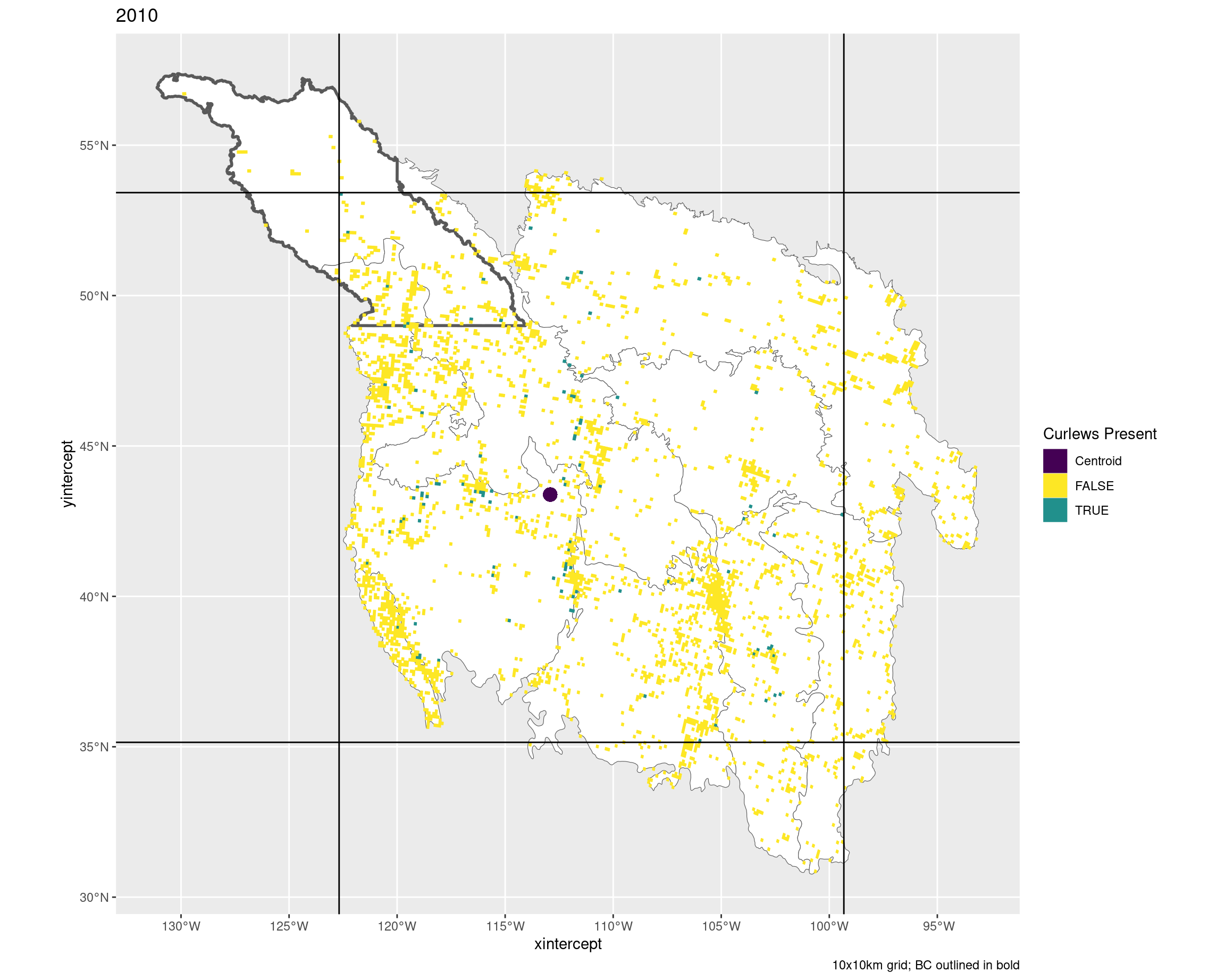
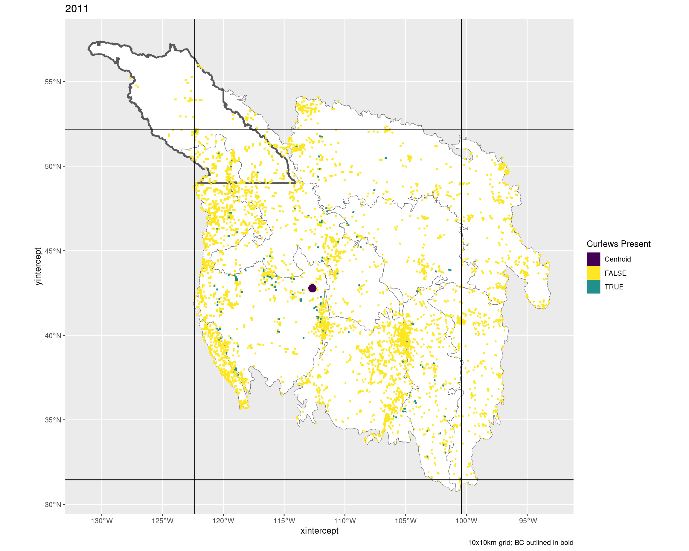
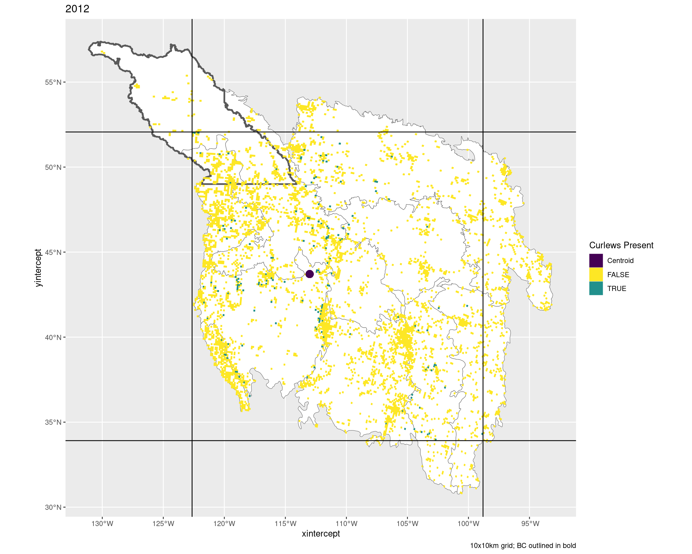
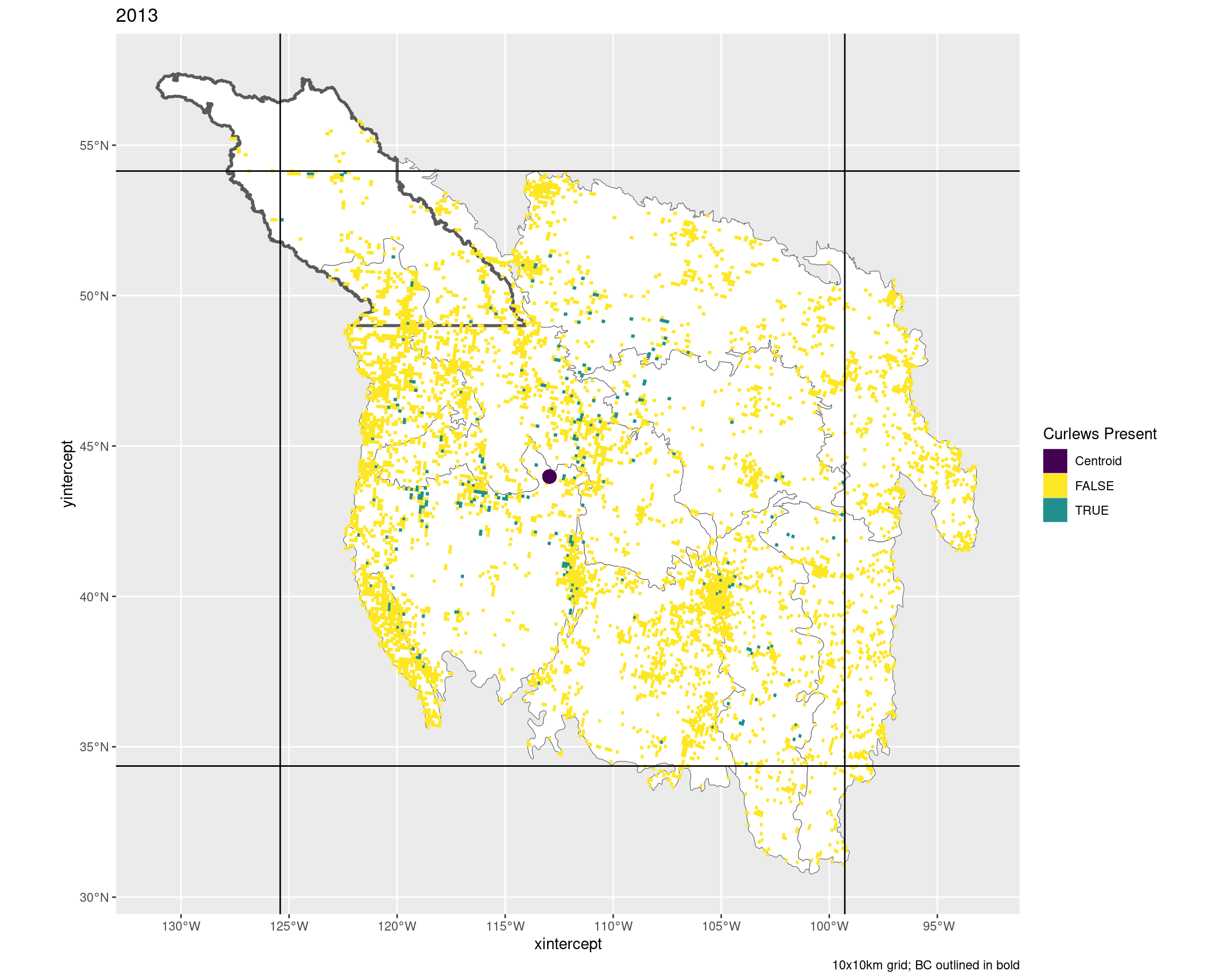
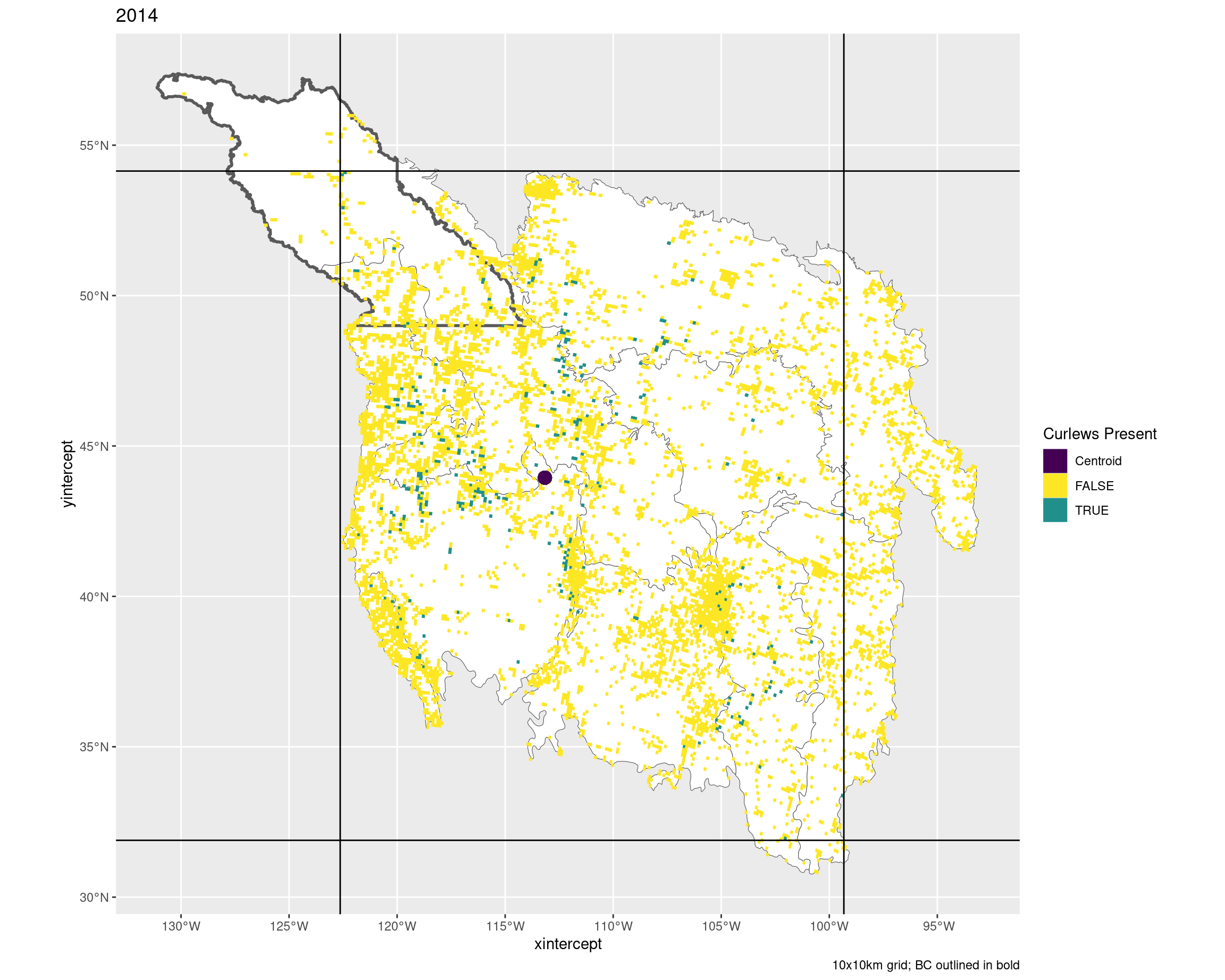
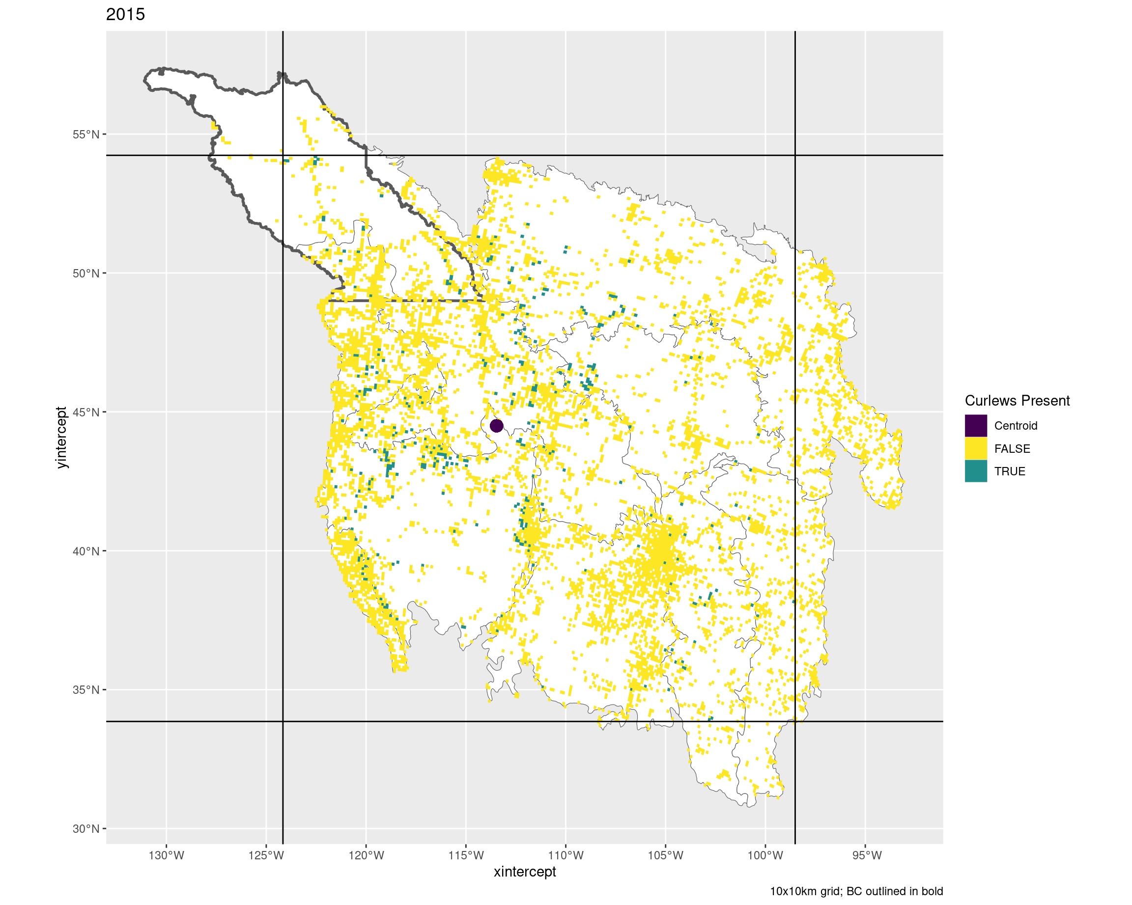
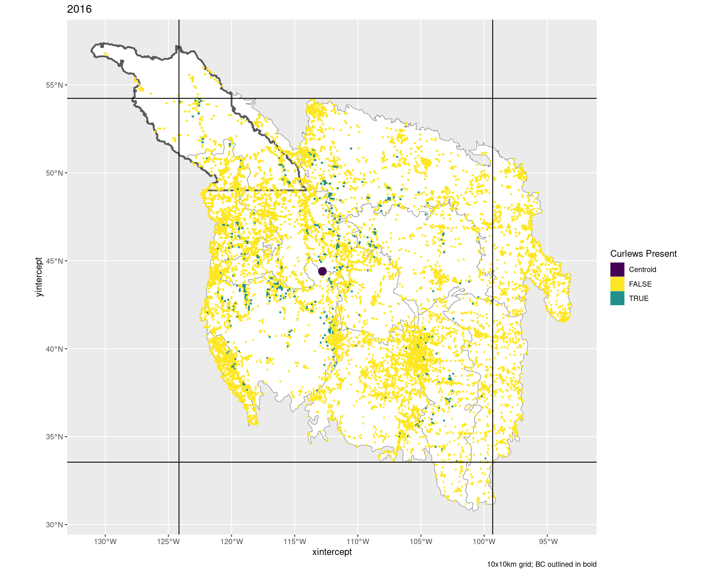
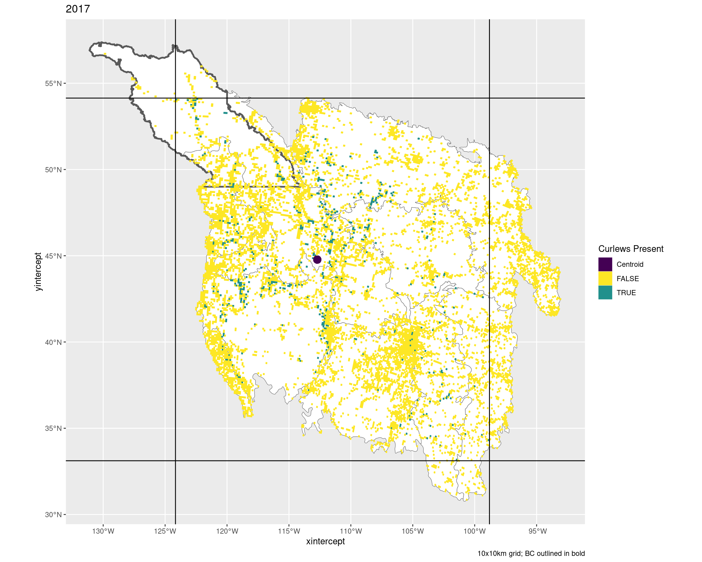
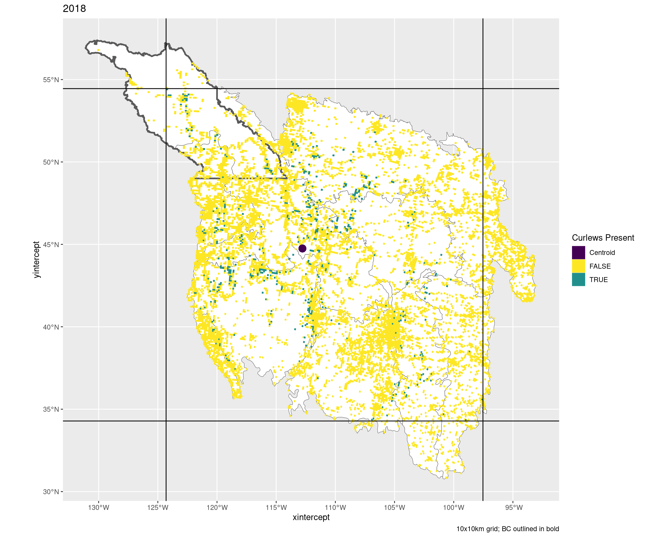
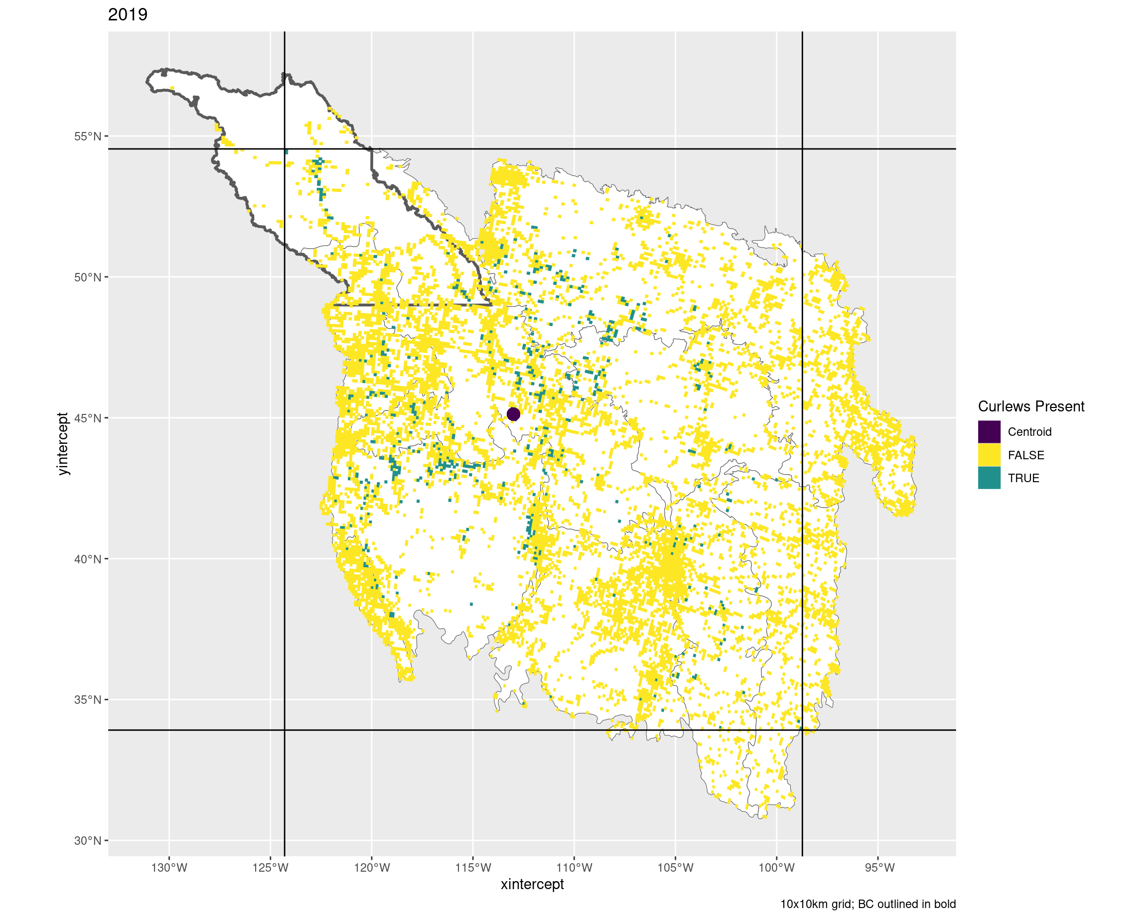
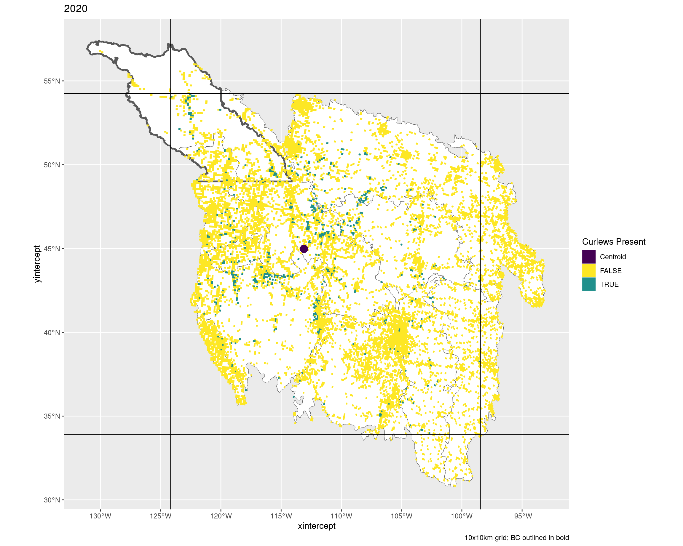
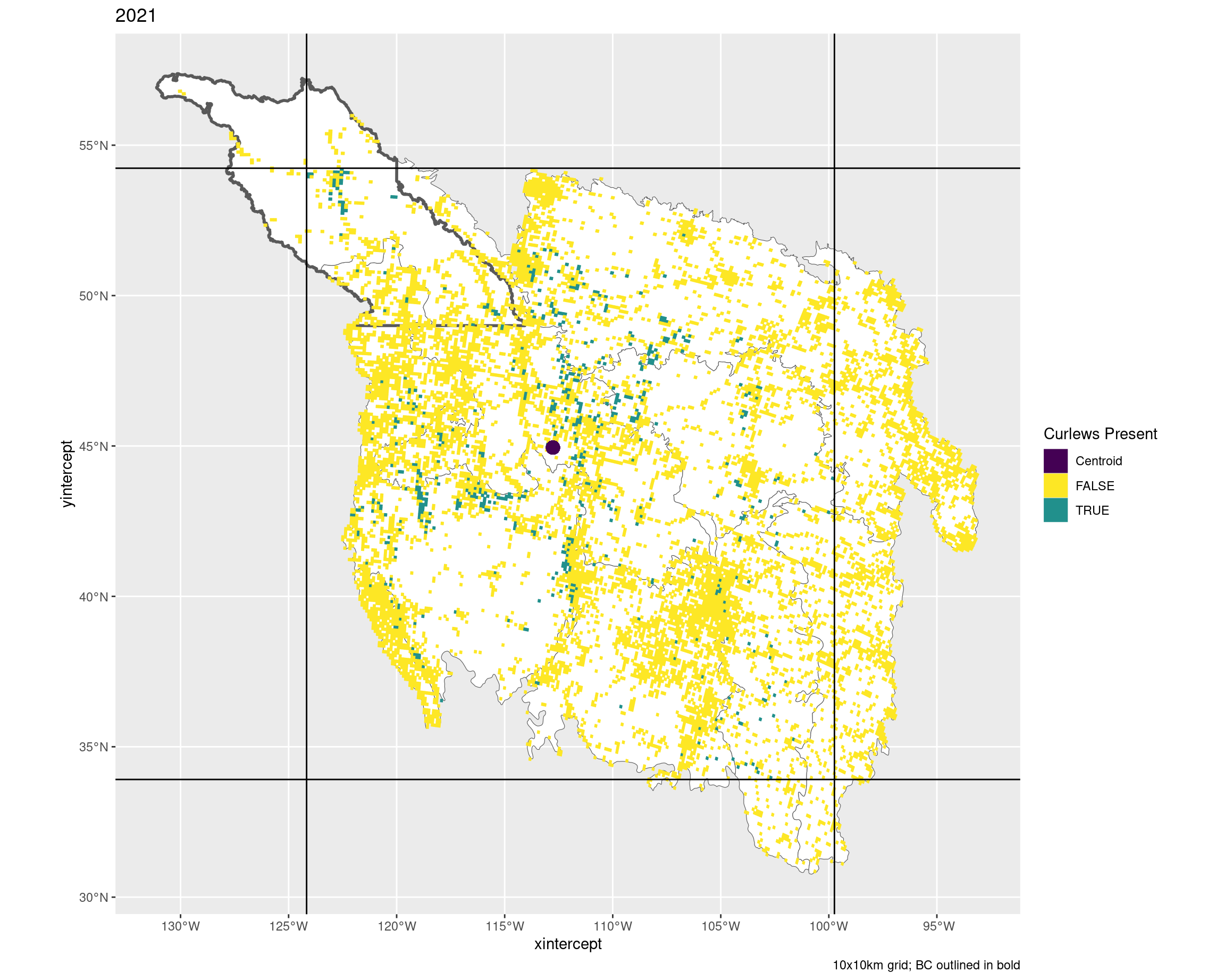
This document contains grid maps of each year showing the observed curlew grids against the non-observed grids. I’ve put on the max/min lat/lon and the centroids for these observed grids as a sanity check to make sure it looks like the calculations are accurate.
These maps show quality controled data (i.e. >= 5 or 10 years with a checklist), but are not filtered by distance percentiles (because I think you shouldn’t :P).
To see an image more closely, right-click and select “Open Image in new Tab” (or similar)
library (tidyverse)library (sf)library (patchwork)<- read_rds ("Data/Datasets/base_map.rds" )<- read_rds ("Data/Datasets/bcr_map.rds" )<- read_rds ("Data/Datasets/bc_map.rds" )<- read_rds ("Data/Datasets/final.rds" ) |> filter (region == "all" , grid_perc == "grids_100" , trt == "all" ) |> select (area_ha, year, grids)<- read_rds ("Data/Datasets/final.rds" ) |> filter (region == "all" , grid_perc == "grids_100" , trt == "present" ) |> select (area_ha, year, min_lon, min_lat, max_lon, max_lat, cent_lon, cent_lat)<- left_join (final, present_measures)
Joining with `by = join_by(area_ha, year)`
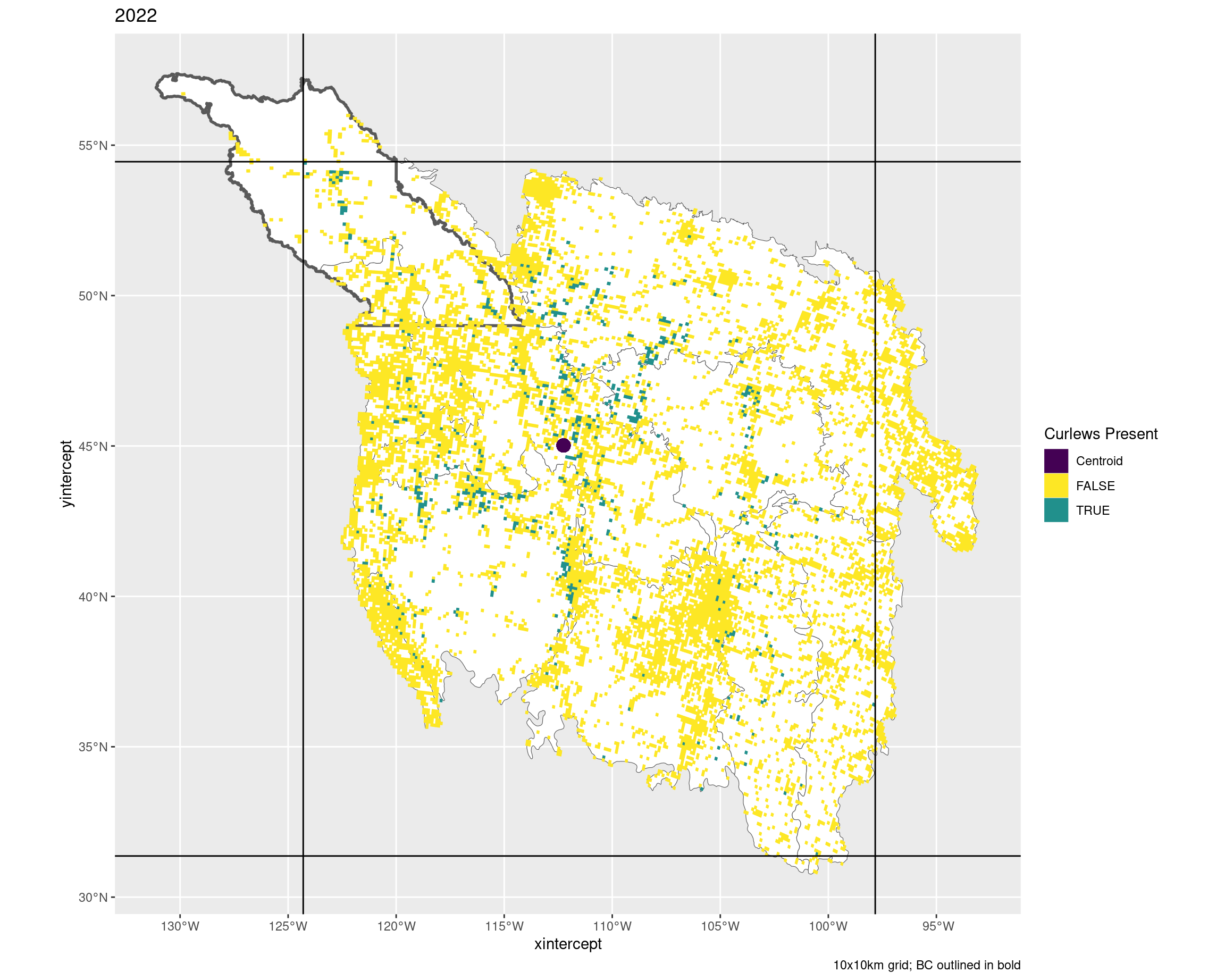
10x10 grids by year
Box defines the min/max lat/lon for the grids with observed curlews
The dark squiggle at the top is British Columbia (only the BCR regions of interest)
The purple dots are the centroids of the grids with observed curlews
<- plot |> filter (area_ha == 10000 ) |> pmap (~ ggplot (..3 , ) + geom_sf (data = bcr, fill = "white" ) + geom_sf (data = bc, fill = NA , linewidth = 1 ) + geom_sf (aes (fill = presence, colour = presence)) + coord_sf (crs = 4326 ) + geom_hline (yintercept = c (..5 , ..7 )) + geom_vline (xintercept = c (..4 , ..6 )) + geom_point (x = ..8 , y = ..9 , aes (colour = "Centroid" ), size = 4 ) + scale_fill_manual (values = c ("Centroid" = "#440154" ,"FALSE" = "#FDE725" ,"TRUE" = "#21908C" ), aesthetics = c ("colour" , "fill" )) + labs (title = ..2 , fill = "Curlews Present" , colour = "Curlews Present" ,caption = "10x10km grid; BC outlined in bold" )walk (g, print)
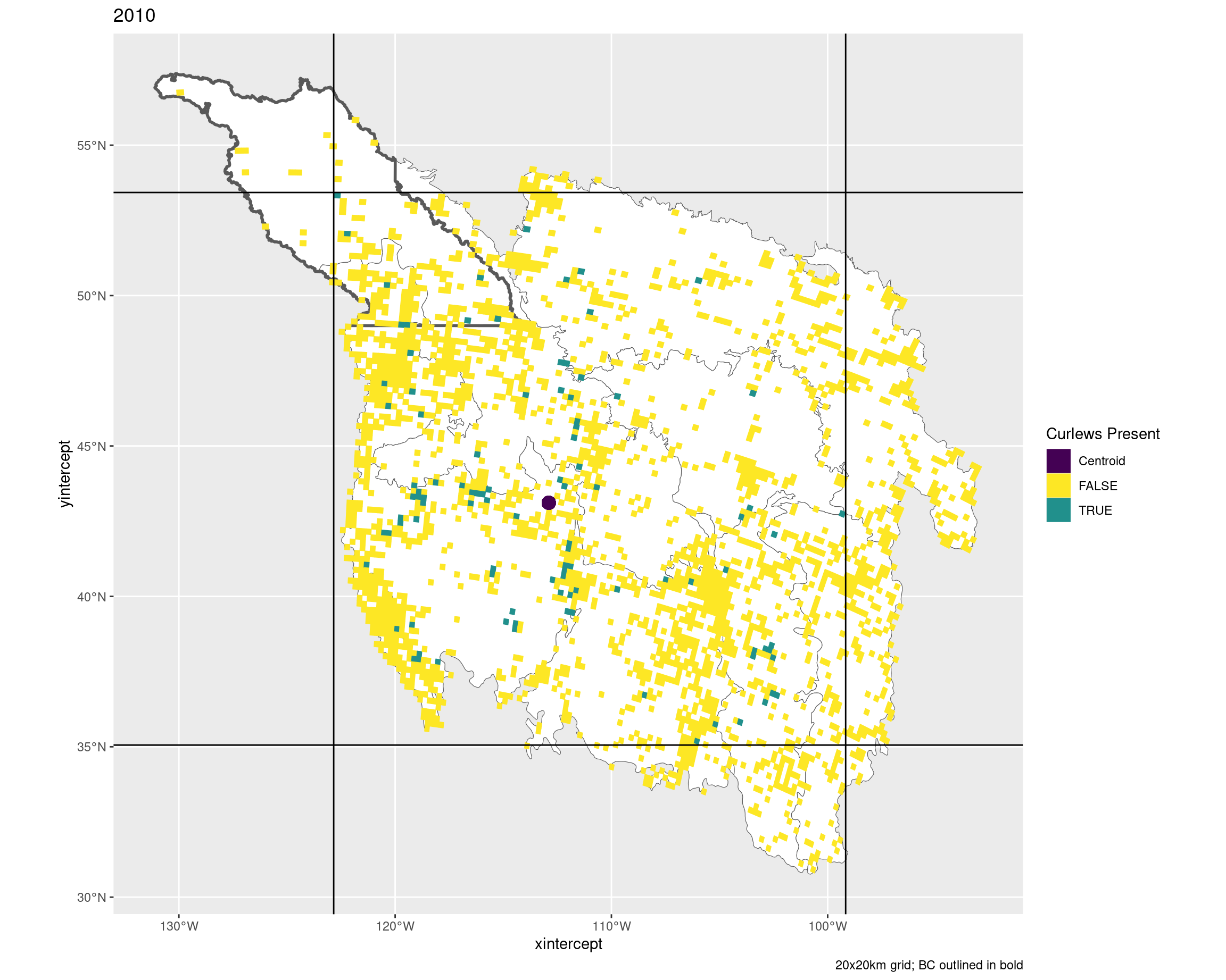
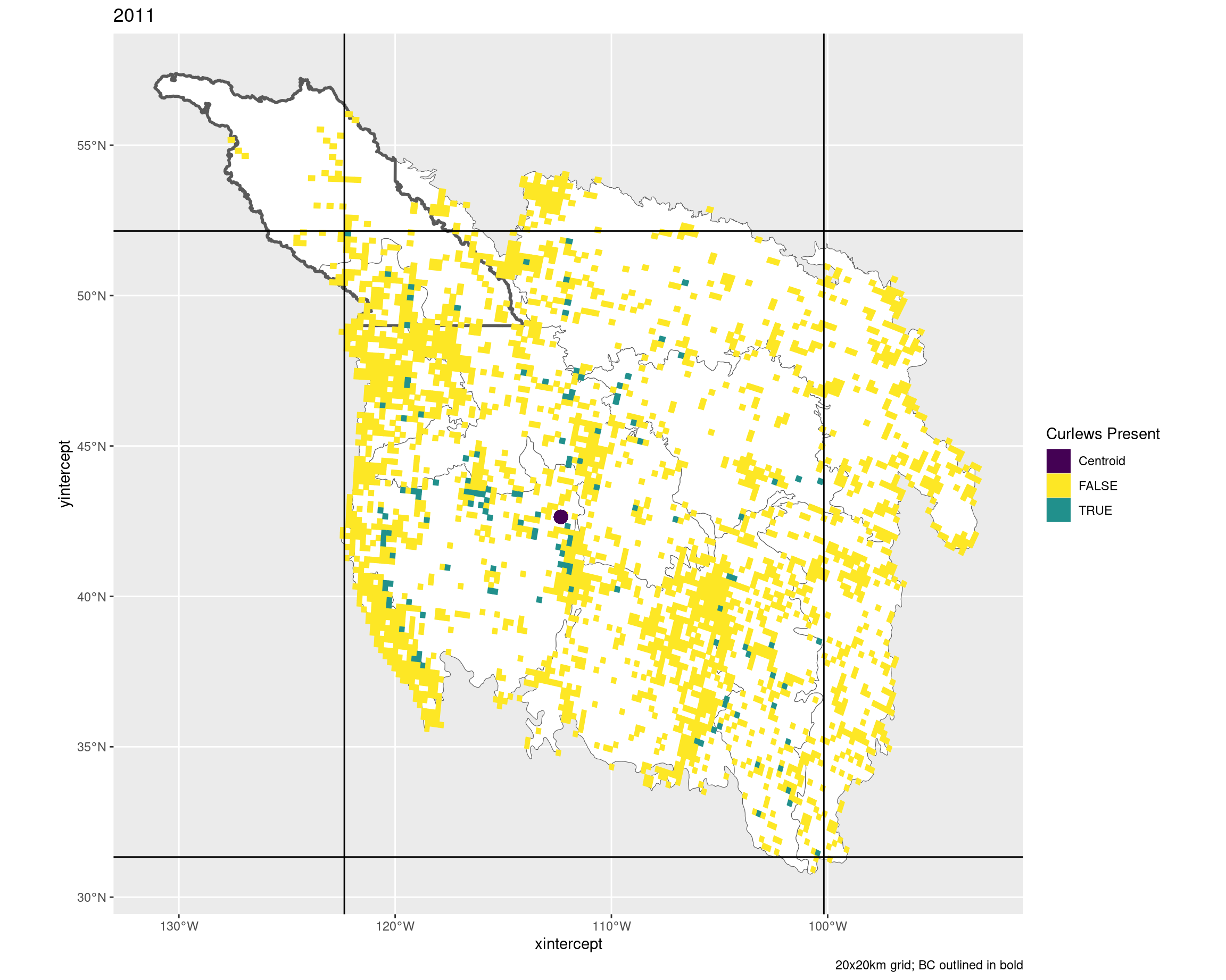
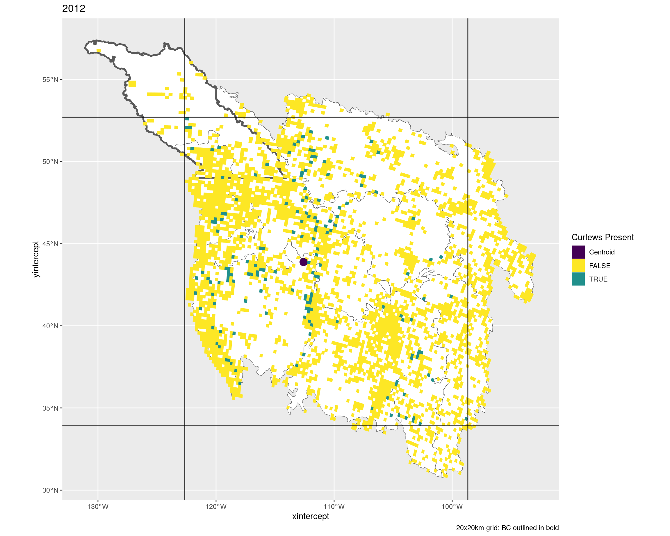
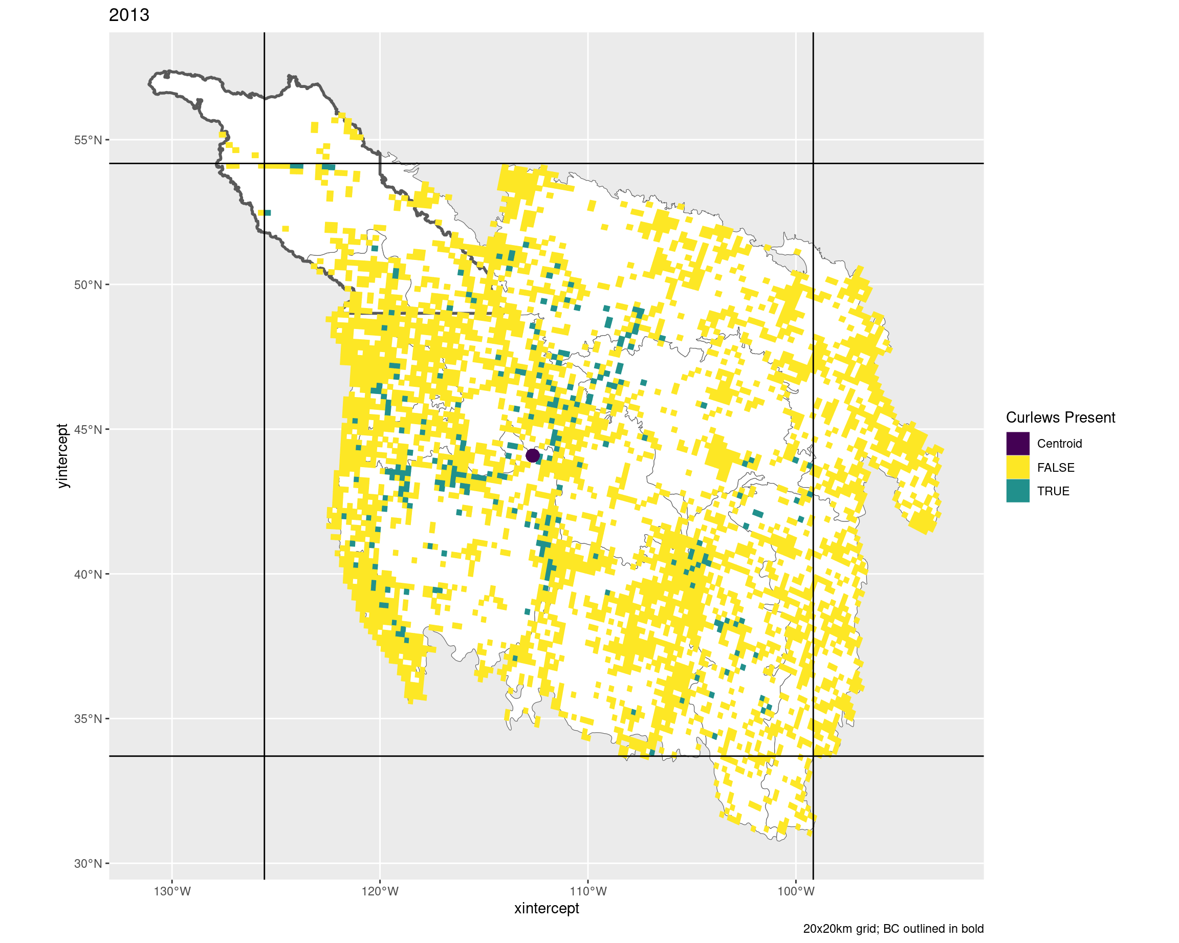
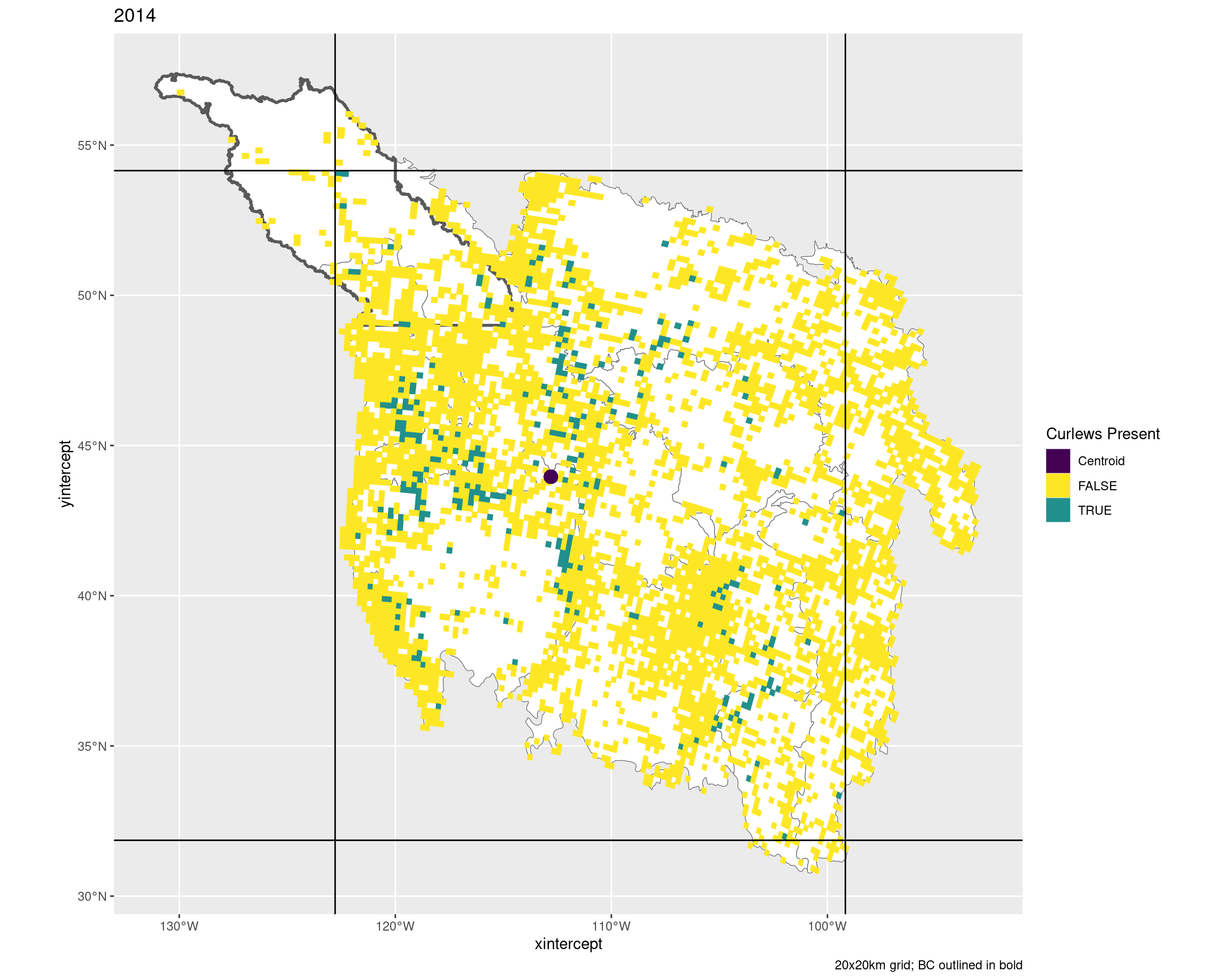
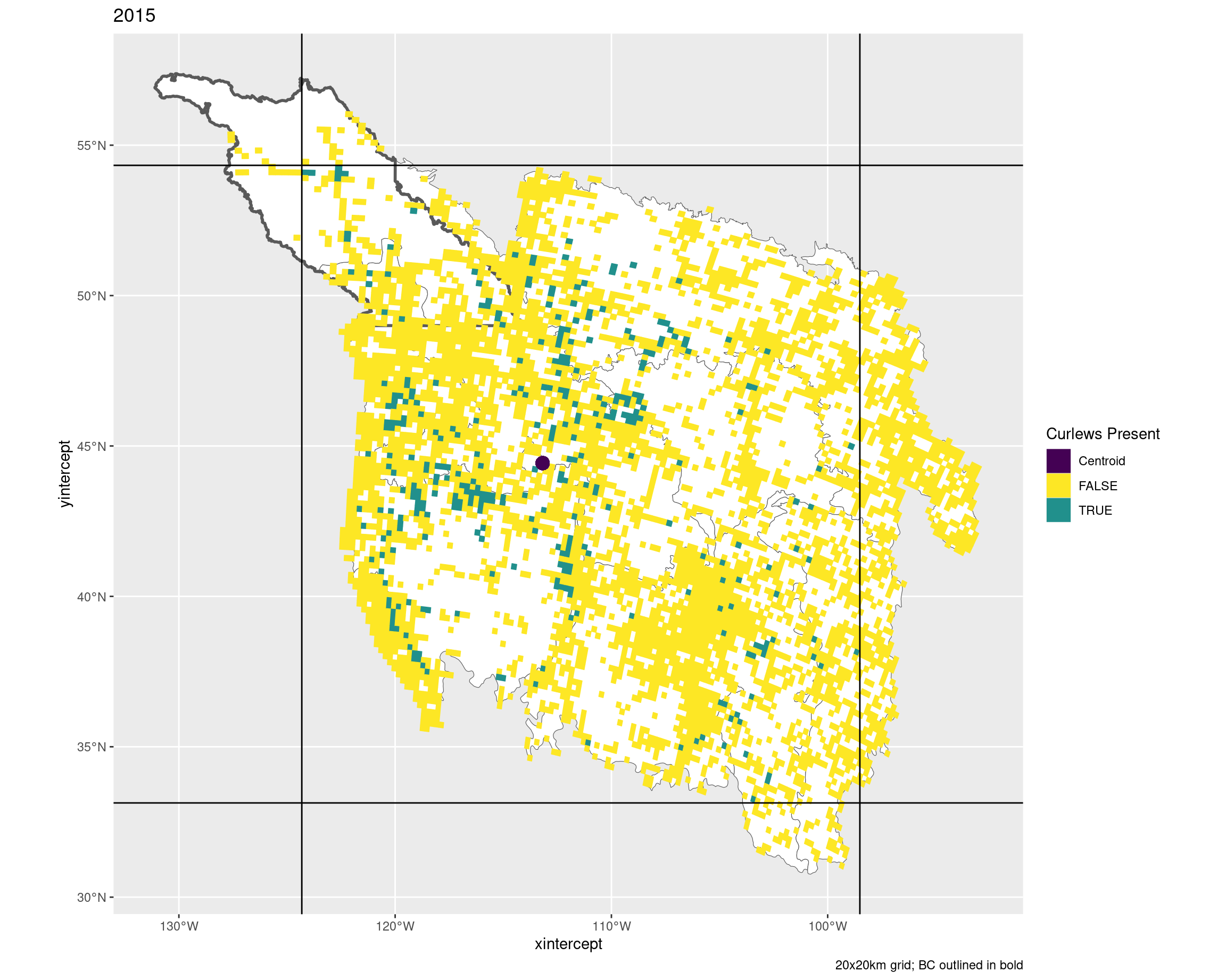
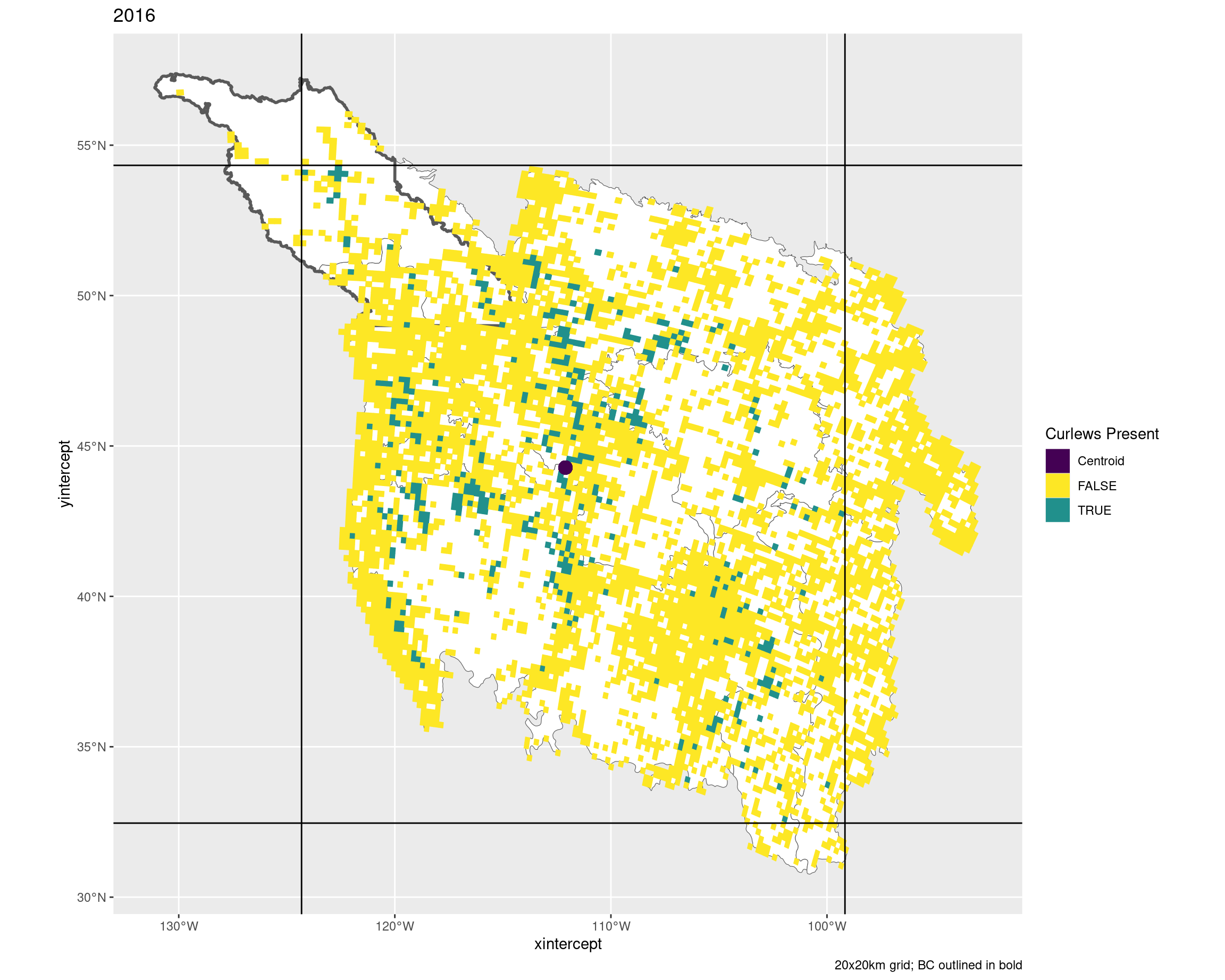
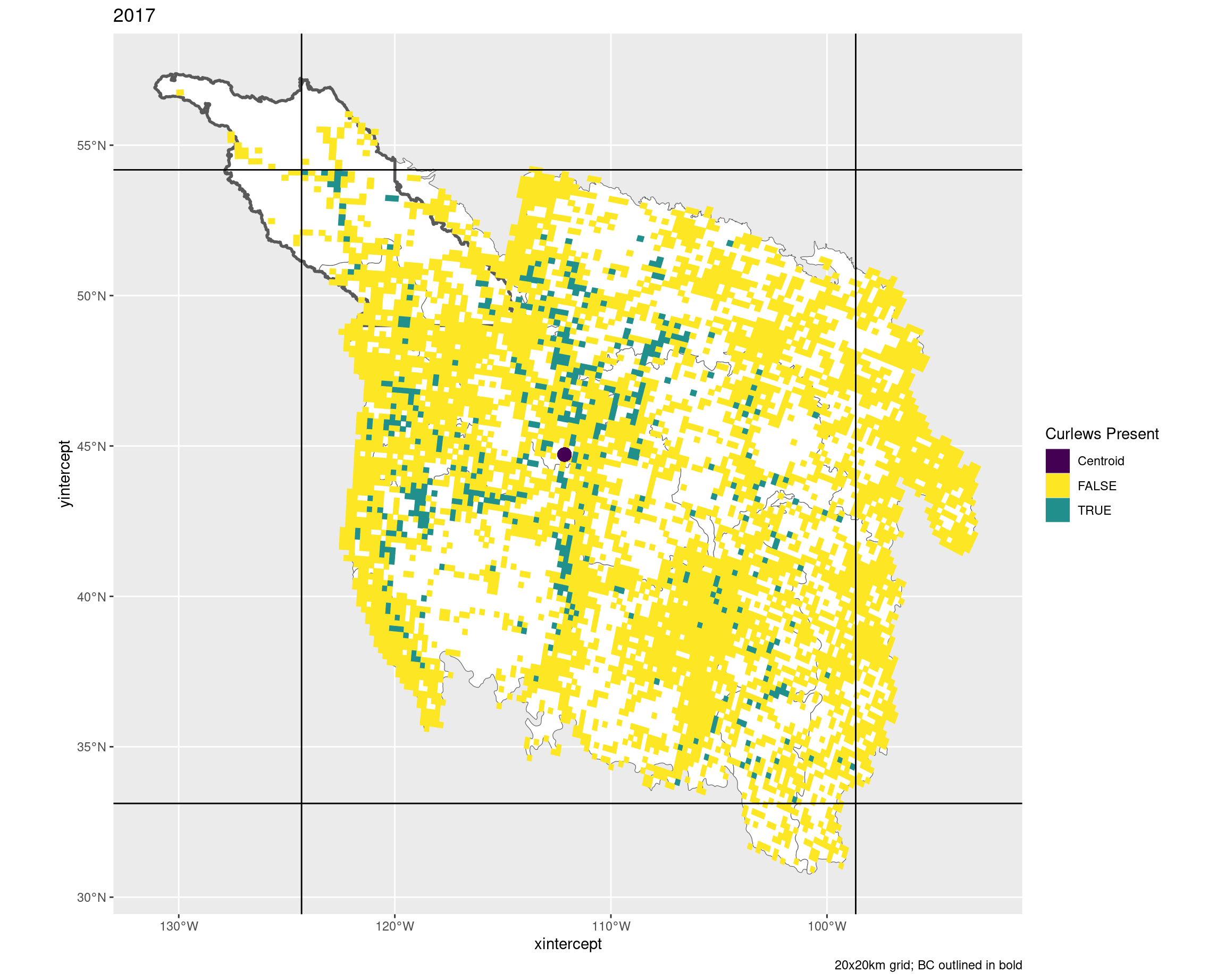
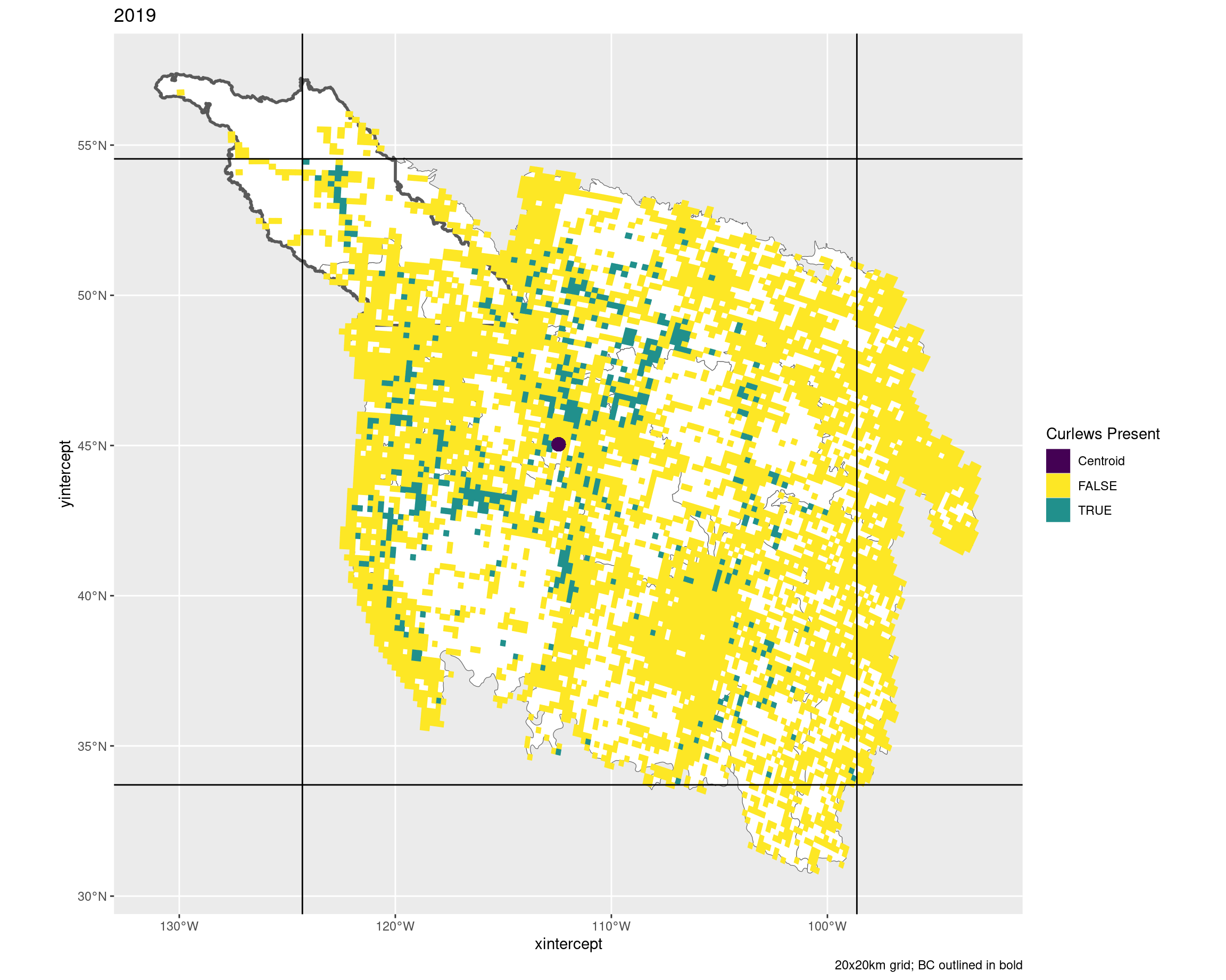
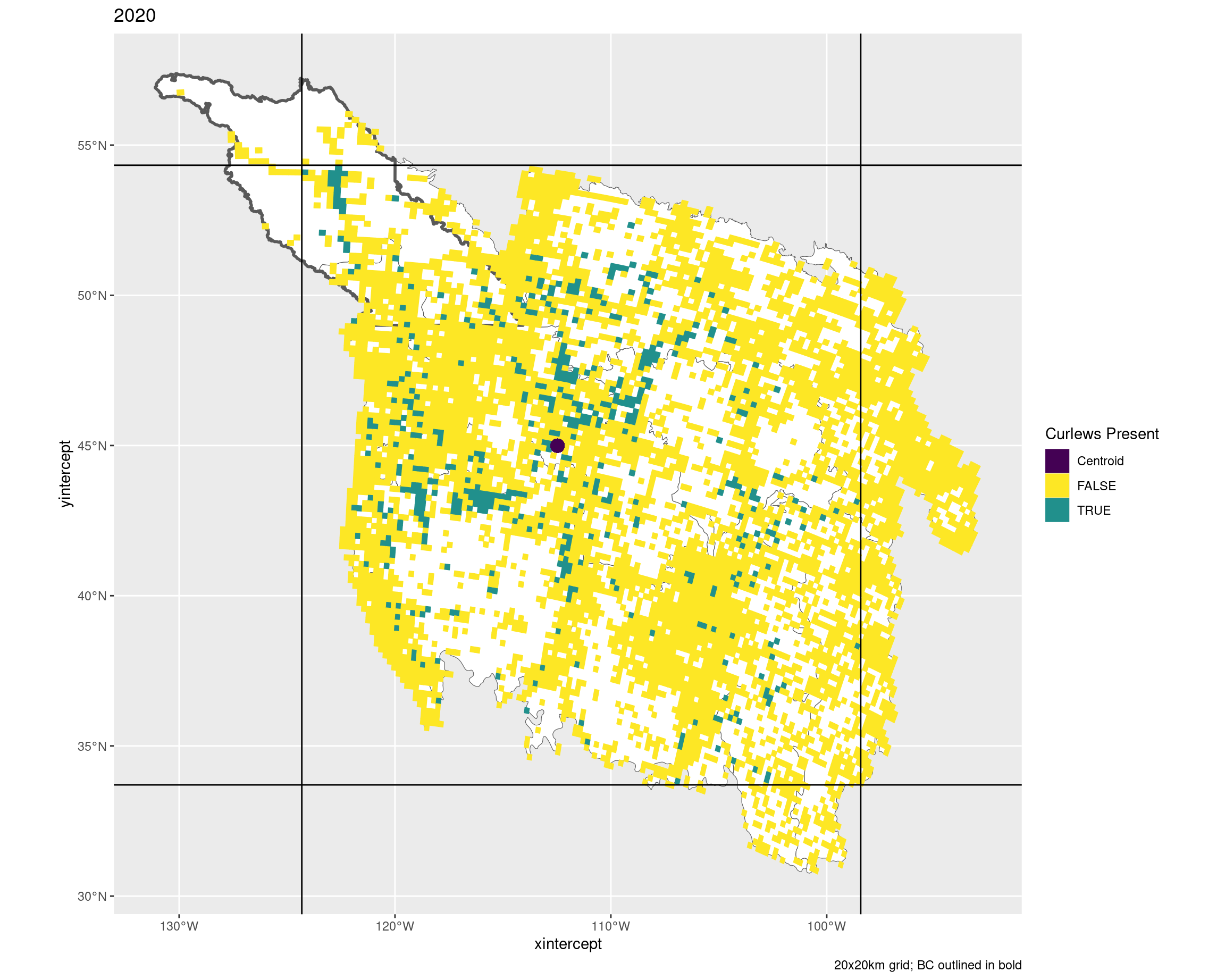
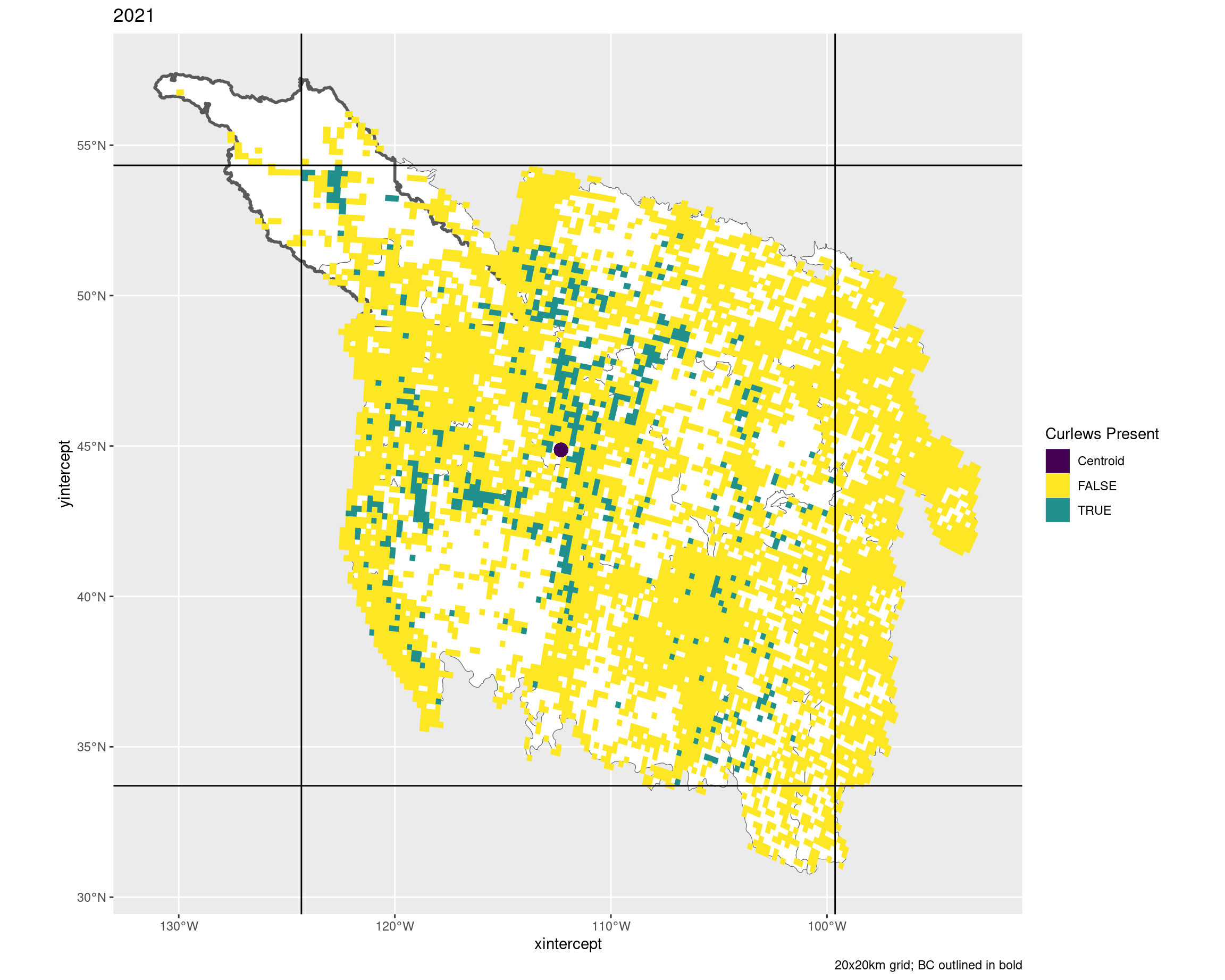
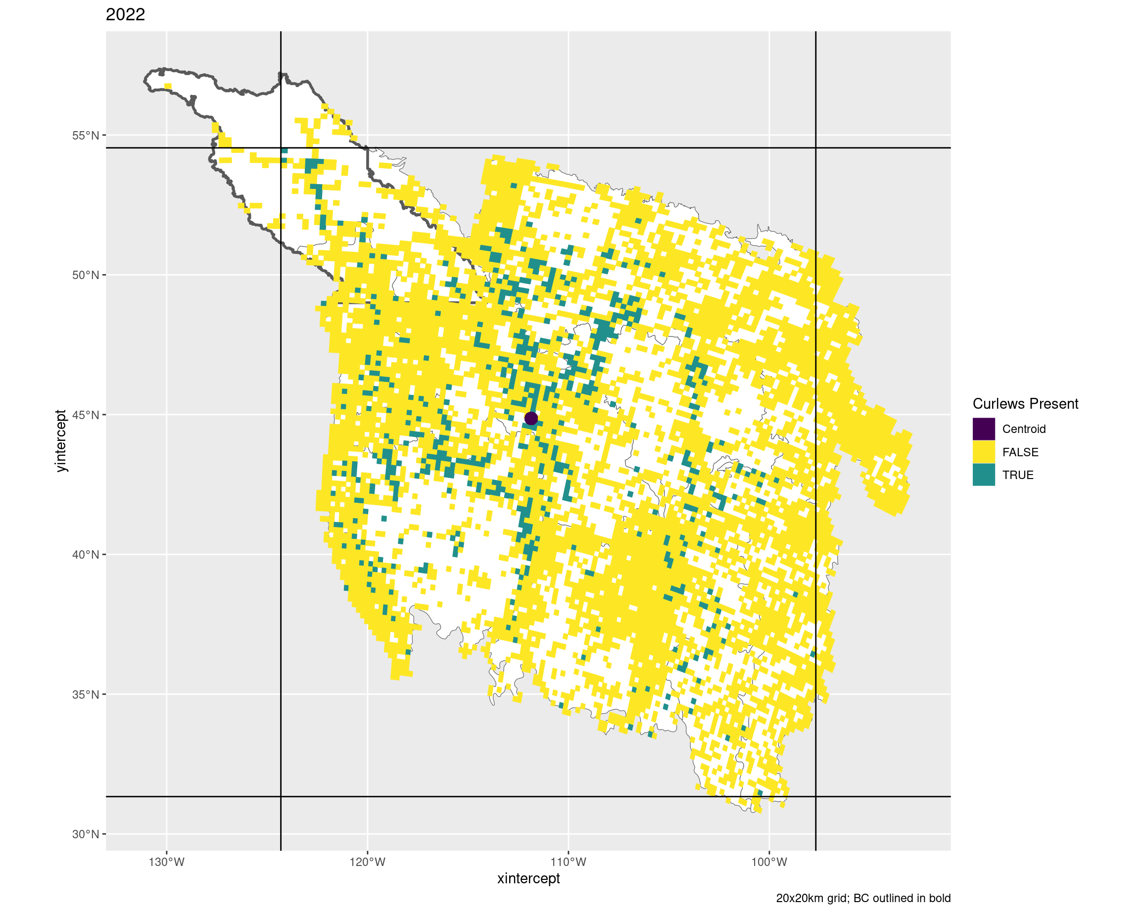
20x20 grids by year
Box defines the min/max lat/lon for the grids with observed curlews
The dark squiggle at the top is British Columbia (only the BCR regions of interest)
The purple dots are the centroids of the grids with observed curlews
<- plot |> filter (area_ha == 40000 ) |> pmap (~ ggplot (..3 , ) + geom_sf (data = bcr, fill = "white" ) + geom_sf (data = bc, fill = NA , linewidth = 1 ) + geom_sf (aes (fill = presence, colour = presence)) + coord_sf (crs = 4326 ) + geom_hline (yintercept = c (..5 , ..7 )) + geom_vline (xintercept = c (..4 , ..6 )) + geom_point (x = ..8 , y = ..9 , aes (colour = "Centroid" ), size = 4 ) + scale_fill_manual (values = c ("Centroid" = "#440154" ,"FALSE" = "#FDE725" ,"TRUE" = "#21908C" ), aesthetics = c ("colour" , "fill" )) + labs (title = ..2 , fill = "Curlews Present" , colour = "Curlews Present" ,caption = "20x20km grid; BC outlined in bold" )walk (g, print)